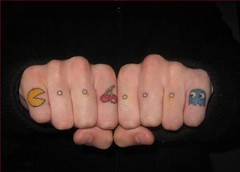
Pacman

I'm a big fan of unique tattoos, even if I wouldn't choose to showcase most of them on my own personal canvas. Apparently these are some of the weirdest tattoos out there. As far as designs go, I think it's definitely important to appreciate the fact that some artists can render these images on human flesh. My personal favorite is the PacMan.
Although some of these designs are definitely lacking in technical execution, many of them still offer unique concepts. Furthermore, I seriously doubt that I could have produced such a successful creation on the knuckles of a PacMan fanatic.
Poor grammar
This semester I'm following a blog known as "The Ministry of Type," which, as you can guess, features articles about typography.
The blog's most recent post, "Dot Dot Dot, An Animated Review" links to a really great animation constructed via typography. The video features a (very) poorly written video game review. The animation's total presentation and voice over are over-dramatic in a totally awesome way: if you have a few minutes and need a good laugh you should definitely check it out. Here's a sneak preview of the dialogue:
"pepole think this review is worthles.
go ahead! say it! i dont care! im just trying to make a point here!
blam this piece of crap!!!!"
End scene.
Thanks for appreciating my nerdgasm.
>>>danielle<<<

No comments:
Post a Comment