totally rad
A couple of weeks ago Ministry of Type showcased the type treatment on this great South by Southwest ad. It has a totally rad scrolling feature that you MUST check out. Seriously, it takes like 10 seconds. And there's a great surprise at the end, too. Just click the picture below to see the real interactive version.
totally rude
As we prepare to graduate and enter the workforce, we're facing a whole slew of intimidating obstacles. Maybe you're nervous about finding a job or scared to enter the real adult workforce. Or maybe, like me, your fear of failure is hindering you from pursuing your passion.
If you feel apprehensive about your future, appreciate lewd humor and need some honest advice, this is right up your alley. It's definitely applicable to anybody preparing to graduate and strike out on their own for the first time. The author of the article, Julien Smith, has one message for all of us: "It’s time you stopped being a fucking pussy."
Wednesday, March 23, 2011
Response: magazine prototype progress
My fellow design capstone junkies and I are preparing to leave for spring break to pretend that we have social lives outside of school. But before we do, we've been sharing the progress of our final projects. Generally, I think all of our groups need to work out the kinks to make sure that our prototypes have a consistent design tone, though disconnects are obviously to be expected with first drafts.
Plaid Dad
I feel your pain with having to differentiate between feature and department content. The design team is definitely on the right track as far as recognizing the different ways to present the information to readers logically. They're doing a good job of keeping their target audience — young dads — in mind while creating design concepts. And kudos for coming up with so many nameplate options.
Good luck everybody, and try to have a relaxing break!
Modern Midwest
This publication definitely has a lot of interesting content, so seeing where the designs progress from here will be exciting. I know it might take some extra work to find good visuals to work with, but it should be comforting that the designers aren't limited to content that primarily centers around food. I think the magazine's nature will make for some really unique design presentations.Plaid Dad
I feel your pain with having to differentiate between feature and department content. The design team is definitely on the right track as far as recognizing the different ways to present the information to readers logically. They're doing a good job of keeping their target audience — young dads — in mind while creating design concepts. And kudos for coming up with so many nameplate options.
Shindig
I like the idea of using real-world textures, and I hope you guys are able to find some great ones that correspond with the publication's tone. Also, unlike others, I personally like the publication's title, and the design style does completely reclaim the word. I think your overall design concepts were interesting, and I can't wait to see them implemented.Cupboard
The content for Cupboard is also pretty unique, but at the same time I think it would be difficult to come up with concepts for some of the stories. The crafty feel that the publication is taking on is fun. I would try to play that up as much as possible.Good luck everybody, and try to have a relaxing break!
Tuesday, March 22, 2011
Critique: VOX food challenges cover
This week's critique features cover concepts I developed to highlight VOX Magazine's food challenges issue that will be printed during spring break. One problem that arose was defining what exactly a "food challenge" is. Apparently it's really just about people eating huge, spicy or otherwise ridiculous food in a competitive nature. All three of my drafts utilized similar color palettes, which wasn't especially intentional but something that's understandable given the color palettes of the food featured.
Jan wanted the burger itself to be more dominant as well as more centered, so I zoomed in on that aspect of the photo and tried to rework its position, as well as the title, to make it more of the focus. I knew the words within the title would be crucial for selling the rest of the story, so I worked with the title a lot to find the best way to convey information.
In the end I was satisfied with the end result. I think it looks like something VOX would run, even though it wasn't the final choice for the issue.
meaty madness
Since the story conveys a tone as though the food involved in the challenges is intimidating and confrontational, I wanted to convey a fun photo illustration that gave a sense that the food is "attacking" the challenger, which would be the reader in this case. Although I'm not sure how feasible this concept would have been in regard to the images VOX photographers had produced for the story, I really like how this one turned out. uncomfortable eats
With this cover concept, I basically wanted to show how unappetizing these challenges can be. I honestly don't think that anybody is going to look at that and say, "Oh, that looks delicious!" I wanted them to think, "Oh God, that looks terrible. Who in their right mind would try to eat that?" Fun fact: after printing my first drafts for critique, my boyfriend pointed out that he read the title as "Uncomfortable Cats." Obviously this would have been a problem, so I would have worked with the type.the human element
I personally thought that the most compelling part of the story is the fact that actual people choose to partake in these challenges. I definitely thought that showing somebody in the midst of a food challenge would be the best way to entice readers to pick up the issue. In the end, this is the one that the editors and art directors wanted me to rework for our final drafts.final draft
Unfortunately, once the rest of the photos came in from the photographers, I quickly saw that there weren't any new ones that featured an individual partaking in a challenge. Instead, the photos were basically still-shots of the food, which were obviously not interesting as far as compelling cover images go. I looked through the photographer's raw files of this burger shoot, but this was still the best image as far as content and framing were concerned.Jan wanted the burger itself to be more dominant as well as more centered, so I zoomed in on that aspect of the photo and tried to rework its position, as well as the title, to make it more of the focus. I knew the words within the title would be crucial for selling the rest of the story, so I worked with the title a lot to find the best way to convey information.
In the end I was satisfied with the end result. I think it looks like something VOX would run, even though it wasn't the final choice for the issue.
Wednesday, March 16, 2011
Response: designing for VOX's special travel issue
 or, "why meeting deadlines is crucial for journalists"
When taking an exam in one of my first real journalism classes at MU (Cross-Cultural Journalism) my professor poked fun at the last few students staying past class to finish up their exams. I'll always remember her saying the bunch of us would probably be good journalists since we were determined to work straight up to deadline.
I have another theory, however. I believe a fair number of people are attracted to studying journalism because it allows for procrastination (to an extent). As a student who's nearing alum status at one of the world's strongest journalism programs, I can tell you all about the rush of adrenaline you get from pumping out a piece right before deadline. It doesn't matter if you're reporting a breaking story or designing 1A. Finishing your work right before deadline — and knowing you did a good job – is one of the most satisfying feelings in the world. Even if you're not really procrastinating, it sure does feel like you've been trying to play catch-up.
But there are some who take procrastination too far. They consistently fail to meet their deadlines, which makes it hard for those who work after them to further develop a story. Procrastinators make life harder for those who plan ahead and schedule every step they're going to need to take in order for a story to be published on time without errors.
Unfortunately, designers are all too often left at the end groping for content that isn't available, which requires us to (at times) create designs with a limited understanding of the story to be presented. It is both our curse and our opportunity to make sure that everything in a story's package comes together in a visually appealing, content-driven way. Without the content, though, this can be difficult to navigate.
I know a number of designers struggled with this while working on this week's special edition of VOX. The problems can't be blamed solely on procrastination. A good majority of the publication's template was reworked for the special issue, which threw off everybody working on the issue. Miscommunication played a role as well.
The bottom line is that each individual on the chain needs to work his/her behind off as to not hinder the progress of those who come after them. And if something should go awry along the way, it's okay to admit your fault, apologize to those whose progress you slowed down and then move on with life.
You can't miss: blog redesigns and renovations
 During this past week, The Ministry of Type has posted new articles four times. The blog apparently hadn't been updated because the owner was redesigning the blog. The new blog is easier to navigate, and the overall design is cleaner and more streamlined.
The owner also redesigned the blog's logo, which is something that was of special interest to me since I just finished working on logo designs for SJI. Here's a screenshot from the site that shows the logo's progression over the years. I really like the new, simplified logo. I generally think that when a design element is simplified, it almost always looks better. Thus far, this ideology has held true based on my experiences with VOX Magazine.
You should definitely check it out when you have a chance.
After getting acquainted with the new display, I started thinking about why blog redesigns can be good. I began searching to find some good information about bettering a blog. BloggingExperiment.com outlines some of the benefits that can come from redesigning a blog. If you're interested in professionally blogging for a company, AnotherBlogger.com offers advice on how to build a better company blog. The advice in both of these articles can be applied to personal blogs for those wanting to increase their readership, so get to reading and rejuvenating.
Critique: final SJI logos
This week I reworked my top five SJI logos that had been selected from the original 20 concepts. The main change I made was working with a different color palette to give the logos a more professional feel. I also changed up a few of the typefaces so that the logos had a subtle reference to sports. The Columbia Missourian's sports editor came in and collaborated with our design instructors to choose our best two logos, which we each revised one final time.
This logo is meant to represent the forward progress SJI provides for women and minority journalists when it comes to sports reporting.
The stick figures are running, signifying forward progress into the future. The suggestion of movement also refers to action in sports as well as journalists who are constantly on the move.
The type refers to uniforms that one would see in a number of sporting events.
Each figure is a different color to show that they are each unique individuals, yet their body motion is synchronized to symbolize their unity in achieving forward progress.
This logo draws attention to the organization's emphasis on sports reporting in the newsroom.
The figures come from three very different sports (even though they all feature balls). The greenish yellow ball can refer either to softball or tennis, both of which feature prominent female athletes.
The colors, bold lines and use of type are intended to relate to a young audience, as the organization aims to assist young aspiring sports journalists.
Can't wait to see whose logo concept SJI chooses to represent its mission.
here are my five revised concepts
and here are the final two logos that will be submitted to SJI
This logo is meant to represent the forward progress SJI provides for women and minority journalists when it comes to sports reporting.
The stick figures are running, signifying forward progress into the future. The suggestion of movement also refers to action in sports as well as journalists who are constantly on the move.
The type refers to uniforms that one would see in a number of sporting events.
Each figure is a different color to show that they are each unique individuals, yet their body motion is synchronized to symbolize their unity in achieving forward progress.
This logo draws attention to the organization's emphasis on sports reporting in the newsroom.
The figures come from three very different sports (even though they all feature balls). The greenish yellow ball can refer either to softball or tennis, both of which feature prominent female athletes.
The colors, bold lines and use of type are intended to relate to a young audience, as the organization aims to assist young aspiring sports journalists.
Can't wait to see whose logo concept SJI chooses to represent its mission.
Wednesday, March 9, 2011
You can't miss: terrible, horrible, no good, very bad logos and website designs
It's cold and rainy, and I have about five assignments due tomorrow that I'm working on simultaneously.
I'm feeling agitated to say the least. So rather than share some inspiring design work, I've decided to succumb to the pessimistic, sarcastic (and sometimes rude) half of my personality. This part of me likes to poke fun and judge things that I basically just don't like.
The Logo Design Blog has a hilarious post that showcases The Worst Bad, Ugly & Horrible Logo Designs. Although the writing isn't spectacular, it's definitely something worth looking at for those who don't know much about designing logos. At the bare minimum, avoid making stuff like this.
Interestingly enough, the Missouri Department of Conservation's logo is on the list. I've always thought that thing was ugly, even as a kid admiring wildlife at the state fair each summer.
Since we'll be making mock-ups for our design portfolio websites, I thought I'd try and find some of the ugliest websites out there. Design O'Blog features an article that showcases some of the UGLIEST websites I've ever seen. Takeaway message: try to avoid Sarah Palin and trippy neon colors when designing websites.
Side note, the blog I've been following hasn't been updated since February 13, so I didn't feel the need to feature anything from them this week.
I'm feeling agitated to say the least. So rather than share some inspiring design work, I've decided to succumb to the pessimistic, sarcastic (and sometimes rude) half of my personality. This part of me likes to poke fun and judge things that I basically just don't like.
The Logo Design Blog has a hilarious post that showcases The Worst Bad, Ugly & Horrible Logo Designs. Although the writing isn't spectacular, it's definitely something worth looking at for those who don't know much about designing logos. At the bare minimum, avoid making stuff like this.
Interestingly enough, the Missouri Department of Conservation's logo is on the list. I've always thought that thing was ugly, even as a kid admiring wildlife at the state fair each summer.
Since we'll be making mock-ups for our design portfolio websites, I thought I'd try and find some of the ugliest websites out there. Design O'Blog features an article that showcases some of the UGLIEST websites I've ever seen. Takeaway message: try to avoid Sarah Palin and trippy neon colors when designing websites.
Critique: Sports Journalism Institute logo drafts

Media outlets unquestionably work to attract and maintain audiences, and the public perception of an enterprise is key for its proliferation. This is why effective branding is such a hot commodity. When professionals begin setting up a new enterprise, one of the most important branding components they should consider is the logo.
The mission
The Sports Journalism Institute has recently formed an alliance with the Missouri School of Journalism. SJI has been working to diversify newsrooms since its inception in 1992. The primary goal of the organization is to help women and minorities get access to jobs within the sports department of news publications. According to the SJI website, "The Sports Journalism Institute will bring its 10-day crash course in sports journalism to the Missouri School of Journalism beginning in June 2012.
To help celebrate this new partnership, the advanced magazine design capstone was given the opportunity to create potential logos for SJI, which currently uses no visual branding. Each student created 20 different logo concepts that were whittled down to our five strongest during a critique. We will rework these five, and SJI will choose one of them from the 100 logos submitted. The whole process is a really great learning experience for us.
The process
I found brainstorming logo concepts for this project to be challenging. The ultimate goal of a logo is to encompass the basic ideology of a brand (like a company or organization) in one attention-grabbing visual. The purpose of SJI is to infuse three very different components: sports, journalism and minorities. (The fact that they shouldn't actually be considered so dissimilar is exactly why the organization exists). Incorporating all three of these components into one visual required a lot of careful consideration.
In summary, I thought about how to represent advancement. This is why I worked with the idea of arrows and movement, which is intended to represent forward progress. I obviously worked sports into about a third of the designs. I also tried to use color in a number of different ways. So, these are what I came up with.
I'll go into more detail about the thought process behind my logos when I critique my five finalized logos next week.
Tuesday, March 8, 2011
Response: who cares about the iPad?
Picture this: it’s 2015. You turn on the morning news. Anchors reveal that Sarah Palin and Donald Trump have been engaged in a torrid affair since her first vice-presidential campaign. American Idol just announced that Sisqo, Gloria Estefan and MC Hammer will be the judges for the show’s 14th season. And finally, Apple just released statistics reporting that more than half of American households depend on tablets for their primary computer needs.
Is this the future of our culture? Is it possible that tablets could rule America four years from now, forcing desktop computers into early retirement?
The Missouri School of Journalism’s magazine sequence hosted an iPad Conference on Monday at the Reynolds Journalism Institute. Dozens of industry professionals from media outlets ranging from ESPN to Better Homes and Gardens attended to share their experience with developing and designing apps for the iPad.
I sat in on two sessions, both of which made developing iPad Apps seem extremely feasible for any designer who requires minimal sustenance and REM cycles to function. Matt Bean, the associate vice president of mobile, social and engineering media at Men’s Health, mainly spoke about the logistics developers need to know while brainstorming content for an app. David Griffin, executive editor in charge of e-publishing for National Geographic, explained why images, videos and interactive graphics are so important to the publication’s iPad App.
Despite all of the inside tips that revealed how to develop beautiful apps that are easy to navigate, I couldn’t help but wonder just how much the average American really cares about the media’s current obsession with tablets. David shared some statistics that predicted tablets will be the default computer for 50% of American households by 2015. However, Matt revealed that so far their data shows that only 1% of those who use Men’s Health apps turn into long-term users. That’s a fraction of a fraction of a fraction (whittled down from the number of people that own a tablet to the number of people that have downloaded a MH app to the number of people who actually use it regularly).
So what’s all the brouhaha about?
I’ve personally never used any tablet. Ever. (Can I even call myself a "real" journalist?) Outside of my J-school comrades, I don’t know anybody who actually owns a tablet. I’m not saying that tablets don’t offer an innovative way to consume media, but I am pretty skeptical about how quickly it will catch on and how far it will reach.So far it seems to be pretty indisputable that the iPad leads the tablet pack.From what I’ve observed over the past few years, most businesses outside of the media maintain PC operating systems. I’m not sure how willing these professionals will be to abandon their lifelong relationships with PCs for a product that neither resembles nor functions nothing like anything they’ve used before. That probably goes for a lot of the tablets out there.
I’m not saying the product’s price and simplicity won’t attract an audience. I am, however, skeptical about the general public’s willingness to invest in such a product and then pay for individual apps. I know there’s definitely money to be made, and more importantly, advancements that could help preserve the currently uncertain print industry. I just think that consumers are going to be slow to jump on the bandwagon. Especially when you consider the fact that our generation assumes that paying for media is a thing of the past.
But who knows, maybe the tablet will become the new cell phone. Shoot, maybe I better go buy some stocks. But in all actuality I’m probably just going to sit here and wait until the iPad's price falls below $300. In the meantime I’ll be reading my hard copies of Spin, BRM and MOJO.
Wednesday, March 2, 2011
Response: Ladies' Home Journal makes great use of color in the '60s
I love color. It's definitely the number one art element I focus on with any project I'm working on, which can sometimes be problematic. I'm always drawn to photos with vivid colors, which sometimes isn't the mood that needs to be conveyed. I have to control my inner color enthusiast to keep myself from getting carried away. (But she does look forward for those opportunities when she can escape!)
Over the years I've found that I have a pretty good natural eye when it comes to combining colors, and I really respect it when others can do it successfully. With this in mind, I set out to browse the bound periodical section in Ellis (MU's main library) to find a magazine and decade to critique for our historical perspectives assignment. I wanted to find something that really did appeal to me visually, as well as something that would inspire me. I also wanted to look at a publication that offered an interesting perspective on the decade's cultural implications. After browsing for about an hour, I chose Ladies' Home Journal in the 1960s. Its use of color really captivated me, and I wanted to spend more time absorbing it.
The following are three of my favorite feature designs that I found in various issues of Ladies' Home Journal from the 1960s.
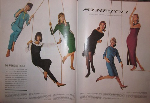
This feature was about some sort of new stretchy material for clothes. I think this concept seems pretty revolutionary for a magazine published in 1964, not to mention how successfully it was executed. But maybe I'm just underestimating the designers' abilities.
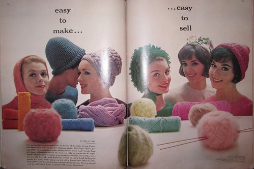
This feature was about knitting your own clothing, which you can also sell for extra cash. Not sure if that's a very realistic, profitable entrepreneurial goal, but who knows. Either way, the use of color here is just outstanding. I don't think I even need to justify that declaration.
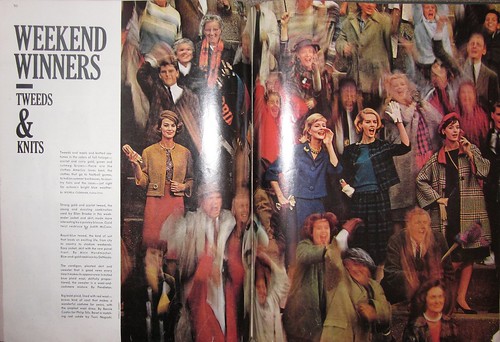
Out of the hundreds of spreads that I studied, this one stood out to me the most. The photo is absolutely spectacular. I've been studying photography for about a year now, and I can't figure out how exactly the photographer was able to create a blurred yet extremely focused photo while still maintaining such vibrant colors. And the type complements the photo perfectly. Everything about this design just feels right. Looking at it makes me feel happy.
And that's all I have to say about that :)
Over the years I've found that I have a pretty good natural eye when it comes to combining colors, and I really respect it when others can do it successfully. With this in mind, I set out to browse the bound periodical section in Ellis (MU's main library) to find a magazine and decade to critique for our historical perspectives assignment. I wanted to find something that really did appeal to me visually, as well as something that would inspire me. I also wanted to look at a publication that offered an interesting perspective on the decade's cultural implications. After browsing for about an hour, I chose Ladies' Home Journal in the 1960s. Its use of color really captivated me, and I wanted to spend more time absorbing it.
The following are three of my favorite feature designs that I found in various issues of Ladies' Home Journal from the 1960s.

This feature was about some sort of new stretchy material for clothes. I think this concept seems pretty revolutionary for a magazine published in 1964, not to mention how successfully it was executed. But maybe I'm just underestimating the designers' abilities.

This feature was about knitting your own clothing, which you can also sell for extra cash. Not sure if that's a very realistic, profitable entrepreneurial goal, but who knows. Either way, the use of color here is just outstanding. I don't think I even need to justify that declaration.

Out of the hundreds of spreads that I studied, this one stood out to me the most. The photo is absolutely spectacular. I've been studying photography for about a year now, and I can't figure out how exactly the photographer was able to create a blurred yet extremely focused photo while still maintaining such vibrant colors. And the type complements the photo perfectly. Everything about this design just feels right. Looking at it makes me feel happy.
And that's all I have to say about that :)
You can't miss: branding and logo redesigns
As the due date for our 20/10 logo competition looms, I've been looking for some more inspirtion on how to branding and designing a successful company logos. The blog I've been following, Ministry of Type, features an article that showcases some really successful logo redesign concepts by Antrepo for products that range from Pringles to Durex condoms. Generally, the new concepts are much simpler (in a precise, content driven way, of course) than the originals. It's important to note that these redesigns are neither commissioned by the companies nor implied to be actual the designer as redesign proposals.
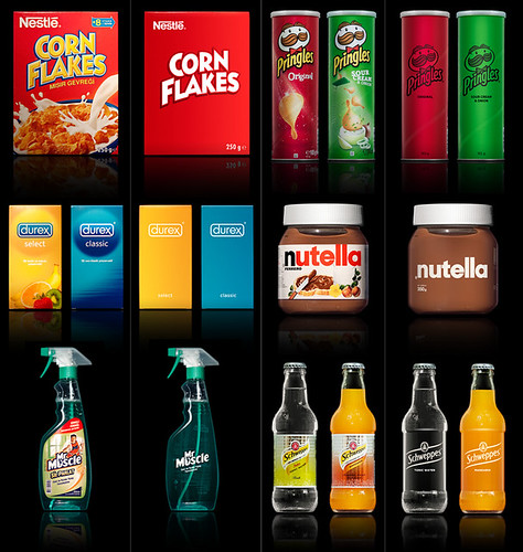

Image courtesy Ministry of Type
I'm not a fan of the simplified Corn Flakes box, as it doesn't really entice me to buy the cereal. I don't think the new Pringles cans are too great, either, but that might just be because the two examples shown are red and green, ha. I do find the Durex box and Nutella jar to be especially successful, though.
Michelle Pais showed me this really cool website last week, and I wanted to share it with you guys, too. Under Consideration.com maintains a few different, really interesting design blogs. One of them is Brand New, a blog that looks at company branding and logo redesigns. They're really cool and modern, and they might be helpful for everybody to look at as we develop logos for our 20/10 project.
Michelle Pais showed me this really cool website last week, and I wanted to share it with you guys, too. Under Consideration.com maintains a few different, really interesting design blogs. One of them is Brand New, a blog that looks at company branding and logo redesigns. They're really cool and modern, and they might be helpful for everybody to look at as we develop logos for our 20/10 project.
Critique: VOX department pages (a.k.a. playing Tetris)
This week I'm critiquing the two department pages I've designed for VOX so far this semester. Interestingly enough, I just noticed that they both feature the same ad. Anyway, both designs required me to play design Tetris in very different ways. (For those who don't live in the design realm, playing Tetris in regard to design basically means that you have to try and make all of the content fit in a space that's either too big or too small. It's generally more of a news design problem, but happens a lot with department pages, too.)
02.03.11 arts department page
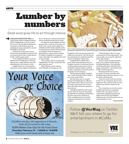
I played a lot of Tetris with this one. The "Lumber by Numbers" story was the only content slated for the page, and it wasn't very long. I tried making the photo larger to take up more space, but its placement combined with that of the ad would have required me to break up the text diagonally, which is a huge design no-no since it's not nice to make the reader jump around so much to read the story. Also, I didn't really think the photo was exciting enough to run very big, either.
After playing around with it for awhile (by breaking some of the VOX design rules), Aaron suggested I add a house ad at the bottom to help even out the spacing. This solution allowed everything to work a lot more fluidly, and I was able to follow all of the rules.
*Side note* I was in love with this headline; it's both clever and catchy.
02.27.11 arts department page
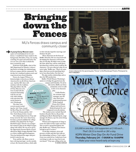
I faced a totally different Tetris challenge with this page. A sidebar story on a completely unrelated topic was also supposed to run on this page. I did spend some time trying to fit both stories on the page. Once I realized that both stories needed the pullout info bubbles I decided there was no way everything was going to fit, especially with the quarter page ad and the length of the "Fences" story. I think the final product here was pretty successful, even if it's not very "design-y." It does it's job.
02.03.11 arts department page

I played a lot of Tetris with this one. The "Lumber by Numbers" story was the only content slated for the page, and it wasn't very long. I tried making the photo larger to take up more space, but its placement combined with that of the ad would have required me to break up the text diagonally, which is a huge design no-no since it's not nice to make the reader jump around so much to read the story. Also, I didn't really think the photo was exciting enough to run very big, either.
After playing around with it for awhile (by breaking some of the VOX design rules), Aaron suggested I add a house ad at the bottom to help even out the spacing. This solution allowed everything to work a lot more fluidly, and I was able to follow all of the rules.
*Side note* I was in love with this headline; it's both clever and catchy.
02.27.11 arts department page

I faced a totally different Tetris challenge with this page. A sidebar story on a completely unrelated topic was also supposed to run on this page. I did spend some time trying to fit both stories on the page. Once I realized that both stories needed the pullout info bubbles I decided there was no way everything was going to fit, especially with the quarter page ad and the length of the "Fences" story. I think the final product here was pretty successful, even if it's not very "design-y." It does it's job.
Subscribe to:
Comments (Atom)


