Showing posts with label you can't miss. Show all posts

Wednesday, May 4, 2011

You can't miss: unique business cards

Now that I've finished my mini portfolio and have seen a proof of it, I'm really excited to begin doing freelance work so that I can start getting some professional experience and making a name for myself.

To start getting prepared, I finally ordered CS5 today. The first project I plan to tackle after graduation is creating fliers and business cards to promote my work. But more about that in my response post for the week.

Zazzle features some really interesting options for business cards. If you're looking to design your own, I'd check it out to see what some current business card trends are. For example, I learned that vertical business cards are apparently very in right now.

When I create my stuff, I'll probably keep working with my little bird fellows. I think they express my quirky personality in just the right way. As I mentioned in last week's blog, I've also been fond of the different lemon, black and gray color combinations that are happening right now, so I might try to work that color palette in somewhere, too. 

Trendy indie mustaches have even infiltrated the professional market of business cards. Especially the market of poorly designed business cards...


Vertical cards are everywhere.

 Retro birds are found on only the trendiest of business cards. OMG.

Not sure what you'd this one for. Maybe if you're promoting the Dresden Dolls?


Wednesday, April 27, 2011

You can't miss: awesome people who design invitations

Since this week's critique featured the graduation announcements I designed for myself, I thought I'd explore to find some inspirational invitations. I thought I'd share my top three designers with you. ***Disclaimer: I'm sharing sites of my own free will to recognize the outstanding design content they offer.***

Gourmet Invitations by Tifany Wunschl
Feathers are very in right now for brides planning weddings, and the use of them in this invitation by Tifany Wunshcl is absolutely gorgeous. I'm usually not fond of the pink and black color theme for weddings, but this invitation has me considering it for my wedding in 50 years. Most of the invitations I found on this site exude a chic vintage feel.

Elizabeth Anne Designs
It was really hard for me to choose just one invitation to showcase from this site because they're all so beautiful. Although  I wouldn't necessarily want to use this as my wedding invitation, I knew I had to recognize its unique and charming nature. Each invitation on Elizabeth Anne Designs is quirky, which probably means that the designers take great care in capturing the couples' individual identities in each invitation. Overall, this site fits with my personal design style the most.

Wedding Paper Divas
You might be able to tell that I have a thing for mustardy, neon yellows and greens, especially when they're paired with black. Maybe that's the direction I'll head in some day. Anyway, Wedding Paper Divas is more of a commercial wedding invitation website. The invitations are basically templates that couples can choose to use for their occasion. So, though the invitations might not be unique to just one couple's special day, that couple would still get a really awesome invitation for a relatively low cost.

After this short excursion into the realm of wedding invitations, I realize I could probably spend (or waste) a great deal of time exploring the medium. Maybe one day I will actually need to ;)

Thursday, April 21, 2011

You can't miss: badass type

Read it. Think about it. This is undeniably badass.

Original photo was taken by Jacklyn Atlas and used in an article by Booooooom.

Tuesday, April 12, 2011

You can't miss: trendy indie fashion blogs

 a screenshot image from Sein.Box

With the ever-growing success of the new Midwest Style blog, it seems that people are finally starting to take midwestern fashion seriously.

A few months ago, somehow ran across a blog called Sein.Box that's based out of Springfield, Missouri. Although it is a little too "hipster" for my liking, the photography is pretty good. And at least somebody is trying to get out there and represent.

As far as my personal style goes, I really like the stuff that Urban Outfitters comes out with, though I never really have enough money to actually justify buying the overpriced baloney from there (Also, my hips/thighs are far too big to rock most of their looks, ha). Either way, check out this sweet wall hanging I found:

And who can pass on this sweet hipster mustache that's on clearance for just $2.99?! Can you believe they didn't sell out of it while it had its original price of $8.00?!?!?! Maybe Midwest Style will pick it up for an even trendier indie outfit...

Wednesday, April 6, 2011

You can't miss: more 30s under 30s!

how I feel about 30 things after working on the 30 under 30 assignment: ribbons and flowers. and really REALLY good clip art :)

for those looking to find a job
Inc. 500's 2010 list of the 30 coolest young entrepreneurs. The founders of Her Campus, FourSquare and Living Social all made the list.

for those interested in photography
Photobite.com features a 30 under 30: women photographers to spread the world about influential women in the field, as the industry is often stereotyped as being dominated by mails.

the best of the best
The Power 30 Under 30 Awards recognizes young leaders from the following categories: 1) Arts, Entertainment & Media 2) Business 3) Community Service 4) Politics 5) Science & Technology 6) Sports. 

for the country music fan
Nashville's top 30 under 30 functions in a way that's very similar to VOX's concept. No, it's not about twangy, corny singers, but people who actually make a difference.

Wednesday, March 2, 2011

You can't miss: branding and logo redesigns

As the due date for our 20/10 logo competition looms, I've been looking for some more inspirtion on how to branding and designing a successful company logos. The blog I've been following, Ministry of Type, features an article that showcases some really successful logo redesign concepts by Antrepo for products that range from Pringles to Durex condoms. Generally, the new concepts are much simpler (in a precise, content driven way, of course) than the originals. It's important to note that these redesigns are neither commissioned by the companies nor implied to be actual the designer as redesign proposals.

simpler.packaging
Image courtesy Ministry of Type

I'm not a fan of the simplified Corn Flakes box, as it doesn't really entice me to buy the cereal. I don't think the new Pringles cans are too great, either, but that might just be because the two examples shown are red and green, ha. I do find the Durex box and Nutella jar to be especially successful, though.

Michelle Pais showed me this really cool website last week, and I wanted to share it with you guys, too. Under Consideration.com maintains a few different, really interesting design blogs. One of them is Brand New, a blog that looks at company branding and logo redesigns. They're really cool and modern, and they might be helpful for everybody to look at as we develop logos for our 20/10 project.

Wednesday, February 16, 2011

You can't miss: the artistic process behind typography, painting and more

This week, 
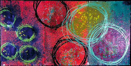
Ministry of Type considers the artistic process versus the end result. The commentary tracks a typographic artist as he creates typefaces, which begins with hand-drawn letters and ends with digitally rendered typefaces created using Illustrator's vector. The post inspired me to contemplate how understanding the artistic processes of different media can help us in our quest to create better art.

art processAs designers we each have our own thought processes we work through with each new project we produce. We might have a great idea, but as the design progresses we might realize that we don't have the ability to execute it successfully and/or professionally. Conversely, we might have a vague idea of something we want to create and end up with something truly extraordinary.

As modern artists working in a digital medium, I think that we often place more importance on the end result without appreciating the process that got us there. As graphic designers using state-of-the-art software, we can easily backtrack, fix or change our creations at any point while creating a work.

Rodabaugh_still_life
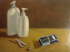
Have you ever painted a still life? I have. It took months, and I absolutely hated it. About a year ago I took a beginning painting class for my fine art minor. I gained an appreciation for the artistic process that I had never before considered. I also learned it's important to plan ahead and make decisions with precision and care when creating a work of art.
my pitiful attempt at a still life>>>

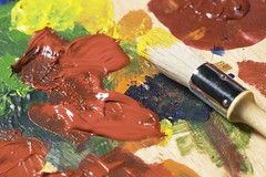
While painting a traditional still life, the painter progresses in layers. The first layer is a monochromatic yet completely detailed painting. Then the painter adds layers of glazes that have painted tints. Over and over. The average still life has about 10 layers of glaze, which is what gives (good) paintings their realistic depth and precise details.

Typically, painters wanting to make changes have to wait for the paint to dry before correcting any mistakes. Photographers have to know how to expose their film in certain lighting, knowing they can only make limited corrections while developing the film in the darkroom. Sculptors, well, if they take away too much, good luck fixing that. 

My painting professor, Nathan Sullivan, obviously understood the process. You can't miss his work; it's amazing

In the end, I really didn't like how my still life turned out. I have no desire to ever display it anywhere (other than here, ha). However, the experience pointed out that our generation is impatient and wants instant gratification, even when it comes to creating art. I must admit that I am no different, which is something I need to keep in mind as I create my magazine designs.

In the end, graphic designers have it easy. We should appreciate the ease of our medium and take the time to fully contemplate our artistic process.

Wednesday, February 9, 2011

You can't miss: Alphabet Guy and tiny letters

alphabetville

In this week's edition of "you can't miss," I'm taking a closer look at the very first design element I ever learned about: letters. To get started, check out Alphabet Guy's outstanding typographic designs. Alphabet Guy, otherwise known as Alan Ariail, has been working with typefaces and lettering for more than 25 years. He creates custom lettering for clients and has a great grasp for the type of work he does (pun intended).

"Lettering has rhythm, flow—including spacial relationship with positive and negative balance. If a consumer cannot easily read the lettering on a printed package, then it fails. My goal while working with designers has always been to create beautiful, easy-to-read lettering with rhythm and balance no matter what the style is."

Alphabet Guy's work is amazing, and it's all hand drawn, which is definitely something to appreciate. His creations are absolutely beautiful. Even if you aren't a huge fan of scripty fonts, you have to respect what he's been able to create. He also redesigns name brand logos like Raisin Bran and Country Time. Everybody should definitely take a few minutes to explore Alphabet Guy's website. Trust me, you won't regret it.

textposter

The blog I've been following, Ministry of Type, didn't have a new post added this week, so I looked through some of the older posts to find something worthwhile to share. To some, the photo above might look like an accounting spreadsheet; however, the content contained on those pages is far from mathematical.

***Geek alert for all you intellectual readers out there*** According to Ministry of Type,  All The World’s A Page is creating posters on which entire literary works such as Hamlet, The Illiad and Faust can be read. According to the producer, the typeset for The Illiad is 3.25pt Malaga. The poster is about 28 inches wide and 30 inches tall and costs about $32 (excluding shipping). That's a lot of tiny letters on one big poster. Happy reading!

Tuesday, February 1, 2011

You can't miss: bold color palettes—then and now

filmnoirpostersColor is one of the seven major elements of art, and it's not hard to understand why. Using color effectively can communicate specific messages and evoke certain feelings.

This week, Ministry of Type featured some great film noir posters. The blog links to a countdown of the best posters that have been created to advertise the niche films.

The composition and design techniques are are both intriguing and inspiring to me. I especially appreciate the bold use of color and the harsh contrasts employed. Most of the posters feature simplistic color schemes created by combining simple primary and secondary colors. The designers obviously took great care in considering how different colors play off one another to evoke certain feelings.

Chihuly

This is a painting created by my favorite present-day artist, Dale Chihuly. He's most known for his work with glass. He creates these great blown-glass sculptures. Some are minimalistic and abstract while others take on natural forms.

I've seen a two of his exhibits, one in Kansas City when I was in middle school and one at the Missouri Botanical Garden in St. Louis. While his glass sculptures are exquisite, I absolutely fell in love with his paintings. He has this technique where he splashes boldly colored paints onto huge canvases one after another. The finished result is a panoramic, abstract work of art with vivid colors. When you see them in person, they just engulf you.

The above image is one of my favorites. It features more contemporary, yet still bold, color palette. And as a typical hipster female college student, of course I have a passion for neon colors.

Whether admiring old movie posters or modern paintings, I can always appreciate the effective use of vivid color palettes. I think this appreciation can be observed in a lot of my work as a designer. 

Cheers.