
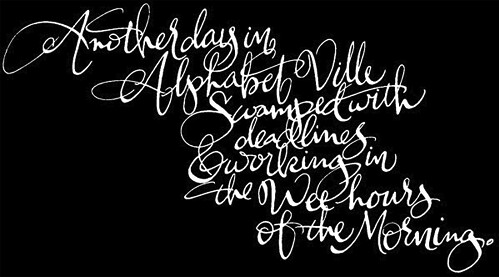
In this week's edition of "you can't miss," I'm taking a closer look at the very first design element I ever learned about: letters. To get started, check out Alphabet Guy's outstanding typographic designs. Alphabet Guy, otherwise known as Alan Ariail, has been working with typefaces and lettering for more than 25 years. He creates custom lettering for clients and has a great grasp for the type of work he does (pun intended).
"Lettering has rhythm, flow—including spacial relationship with positive and negative balance. If a consumer cannot easily read the lettering on a printed package, then it fails. My goal while working with designers has always been to create beautiful, easy-to-read lettering with rhythm and balance no matter what the style is."
Alphabet Guy's work is amazing, and it's all hand drawn, which is definitely something to appreciate. His creations are absolutely beautiful. Even if you aren't a huge fan of scripty fonts, you have to respect what he's been able to create. He also redesigns name brand logos like Raisin Bran and Country Time. Everybody should definitely take a few minutes to explore Alphabet Guy's website. Trust me, you won't regret it.
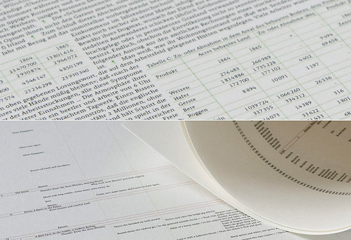
The blog I've been following, Ministry of Type, didn't have a new post added this week, so I looked through some of the older posts to find something worthwhile to share. To some, the photo above might look like an accounting spreadsheet; however, the content contained on those pages is far from mathematical.
***Geek alert for all you intellectual readers out there*** According to Ministry of Type, All The World’s A Page is creating posters on which entire literary works such as Hamlet, The Illiad and Faust can be read. According to the producer, the typeset for The Illiad is 3.25pt Malaga. The poster is about 28 inches wide and 30 inches tall and costs about $32 (excluding shipping). That's a lot of tiny letters on one big poster. Happy reading!
I actually love scripty fonts, but unfortunately, they don't seem to be appropriate in many of the designs I've worked on so far. I'm still waiting for my chance to slip one in... The Alphabet Guy is a fascinating character. It's really cool that all of his art is hand drawn. It's nice to know that there are still some artists out there that work with typography outside of the software and technology that everyone uses as a default these days.
ReplyDelete