
 Well, all of the shenanigans leading up to this project sure did take a whole lot out of me. Of course there was Comosnowpocalypse, which prevented my pitiful Pontiac Sunfire from getting to campus so that I could work on anything tangible. An unexpected sledding injury resulted in a 6 1/2 hour visit to the local ER Wednesday afternoon/evening. As a result I spent the next three days in bed attempting to heal myself.
In an ultimately feeble attempt to work on my design project from home, I downloaded the 30 day trial version of Adobe's creative suite. I was obviously not happy (nor prepared) to set aside 12 hours for its snail-paced download onto my system. Wow. I woke up this morning ready to install it when I learned that my janky old Mac system apparently doesn't support InDesign CS5...$%*#! Needless to say, I got my (injured) rear in gear and was on campus by 10 a.m. prepared to fully dominate both my design and photography projects. Serious productivity (and Red Bull) allowed me to achieve my goal.
Now to the nitty gritty that is critique blogging. The story I'm working with offers a new perspective on an old habit: smoking. The journalist working on the story observes that young adults in Columbia are following a trend of smoking socially rather than habitually.
In other words, smoking is a fun hobby done in social situations—not in daily life. As a college student, I don't think there's really any new, shocking information in the story, but it is noteworthy that this is a trend that's starting to gain some attention. In its entirety the story discusses smoking habits involving cigarettes, hookah, and a limited amount about marijuana (for obvious reasons).
Because the story maintains a light tone, it needs a design that relays a similar feeling. Keeping my technical abilities and limitations in mind, I've created the following three concepts as potential covers for the story.
Cover 1: the social (smoking) network
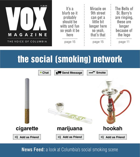
This article is a blatant parody of a certain social networking site *GASP*. Creating replicas of the buttons took the most time. Finding the best photos for the profile shots was also challenging due to the limited availability of certain subject matter on free photo stock sites. If this design is chosen to proceed, then I will probably invest some of my own money in a better image to represent marijuana. (The best ones I found charged fees I wasn't willing to pay upfront.) Ideally I would like to use a vertical image in place of the pipe so the design is more consistent overall. This should also remove the awkward white space.
Cover 2: Generation Y (are you smoking?)
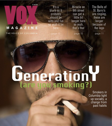
I came up with this head and deck myself (although the deck admittedly needs work). I think that one of the most interesting aspects of the story is the fact that young adults growing up in Generation Y tend to be social smokers rather than habitual smokers. The story tries to answer the question of why this is so.
In this cover I tried to play off the trendy-indie hip qualities that seem to represent Generation Y. I think this cover is pretty successful, but to move forward with it we would either have to shoot our own photo or find a comparable one that's big enough to take its place because this one looks a bit pixelated when printed full-size. I also question whether the use of parentheses might confuse the reader.
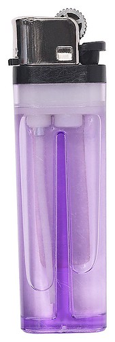
Cover 3: Light up the Night
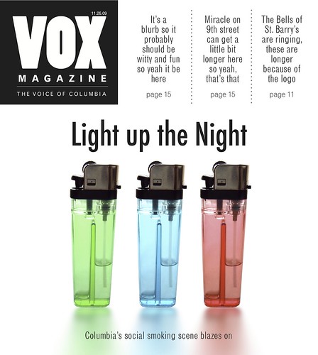
I don't think the VOX editors will choose this design, but I always seem to be drawn to minimalistic designs myself. While searching for various images related to smoking, I came across this photo and fell in love with it for some reason. The color, repetition and balance are all great, and I love the subtle reflection beneath the lighters. The head and deck were provided, although I did question how well it pairs with the image since there aren't actually any flames in the image. In the end I think this would be a simple way to communicate the story's basic subject matter to the reader, but it doesn't really go much further than that.
So what do you think? I'm a big fan of constructive criticism. I'd rather have my designs torn apart now so that I have a chance to really make something great for the final product.
Dang. After staring at all these designs, it's time to go get my nicotine on. (kidding)
>>>danielle<<<
Danielle -
ReplyDeleteI like that you had three very distinct cover ideas here. I really like the concept of the first cover as adding the different smoking elements as "facebook" friends. I'm thinking that the concept in your head was probably better than the execution, but not because it was to your fault of making it look good, but just because it's a hard design to carry out cohesively I think. I have to say that my favorite out of them all is the "Light Up the Night" cover. I agree with you that the image is great the way the lighting comes through the colored lighters and with their shadows. I'm not sure which one was chosen for you to work on more, but even if this wasn't it, I definitely appreciate the positive use of white space and the simplicity. Good job.
Thanks so much for the feedback. The technical execution of the first design definitely took the longest, and I agree that it didn't turn out as wonderful as I had intended. Jan liked the last one, too, but overall the editors decided that they wanted a more human element (expressed via a photo shot by the photographer). In the end they chose the second option and requested I use a photo shot by the photographer so that the local component is evident. Can't wait to get feedback on the revision.
ReplyDeleteI really enjoyed checking out the Alphabet Guy's typographic design! He's awesome. I'm glad your week of disaster is over! It's tough when so many things get in the way. I think your cover ideas are great! I really like the social networking one. You did a great job replicating, and I like how you included the elements, such as "add as friend," clever. The photo you chose for the second cover is great. Hopefully you can find one that's comparable. I think it's bold and successful in portraying the trendy and hip idea.
ReplyDelete