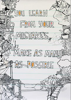
 In a previous blog post, the Ministry of Type shared a project called Advice To Sink In Slowly, which is a project through which college graduates pass on advice to first-year students when they first move in. According to the Ministry of Type:
"Graduates design posters to illustrate their piece of advice, and each new student is given one at random — the idea being that each graduate now knows something they wish they’d known when they started, and that this is how to pass on that advice in a creative and welcoming way."The posters come from a wide variety of designers who have very unique styles. They're definitely something to check out. This one is a screenshot of one of my favorites.
Although you might learn a lot from your mistakes, you probably hope to avoid making them when it comes to web design. UseIt.com features an article that outlines the top 10 web design mistakes that make a site harder to navigate. The list is something to consider for anybody looking to design a website for the first time. (Interestingly enough, UseIt.com is actually very poorly designed itself.)
Since we're all going to have to create a website for our portfolios, this is definitely something that those new to the web design world should take a look at.
Here's a short synopsis of the list:
- Bad search keywords
- Unnecessary use of PDFs (my blog's nameplate just shivered)
- Not changing the color of visited links
- Text that can't be skimmed for key points
- Fixed font sizes (that are tiny)
- Page titles with low search engine visibility
- Anything that looks like an advertisement (as designers, we can appreciate this)
- Violating design conventions (not sure I agree with this one)
- Links that open new browser windows
- Not answering users questions (appreciate your audience!)

First of all, I appreciate you tying your two posts together nicely. I agree with most of the web design tips, but I think PDFs have their place too. Especially for a design portfolio... it would be pretty hard to avoid using PDFs. I also don't really agree with their point about not violating design conventions. While that might effect the navigation of the site (which I suppose is the point of the post), I think there are so many unique possibilities with web design that it's hard to label what's conventional or not.
ReplyDelete