
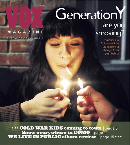
 After last week's critique, the VOX editors decided to go with my cover choice. I was told they appreciated my initiative to tone the photo on my own. The original photos had yet to be toned, and as a result they were almost too dark to work with as far as designing goes.
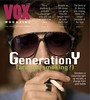
 my original concept>>>
Here's what I turned in (and what they subsequently chose) to be worked on as the VOX cover for the social smoking feature.
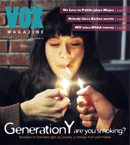
After being chosen, the editors had a number of suggestions for the design. They thought the blurbs took up too much space at the bottom and compromised some of the photo. They also wanted the headline repositioned. When printed, the hot pink blended in with the background too much, so I needed to re-evaluate my color usage.
Here is how I revised the cover for print.
Although the art directors all approved of my decision to use three colors, upper management did not. I was required to downgrade from using three colors to only two, which I found to be extremely problematic. I liked how the top to colors balanced each other out and worked in contrast against their respective backgrounds, so I really didn't want to get rid of either of them. However, replacing the orange with either the turquoise or the pink would have made the overall color use unbalanced. Changing the orange to white would have made the deck blend in with the headline too much.
After a lot of deliberation, Aaron and I came up with a solution we found to be the least of all evils. Here is the final product that VOX printed.
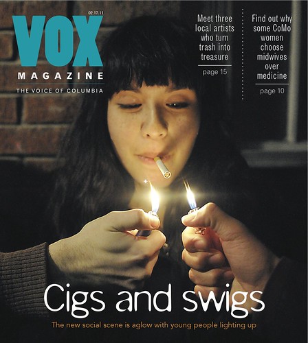
I wasn't a fan of the new headline, so I searched for a new font that didn't look as awkward with these new words. I found one that was similar in nature but didn't have "G's" that seemed as weird. I'm also not a super huge fan of how we did the blurbs, but the issue with three colors versus two really limited the options. (This is also the officially toned version of the photo.) I think the use of only two colors makes the story look much more drab than it actually is.
In the end, I definitely prefer the product of my last revision before the color issue came up. As far as designs go, that's the one I'll be keeping in my portfolio. Working on this cover definitely taught me a lot about the editorial process.
(Did you notice that I wrote my own blurbs on my drafts? I got tired of reading "Billy Joel coming to town" and the like.)
I think overall the cover turned out well. I think the end result colored nameplate goes so well with the photo. This will make a good portfolio piece. I also understand what you mean about the editorial process. It's a long one, but it reminds me of what Maggie Meyer said about designing in the real world. It's a lot of revisions.
ReplyDelete