Wednesday, February 23, 2011

Response: The September Issue

september
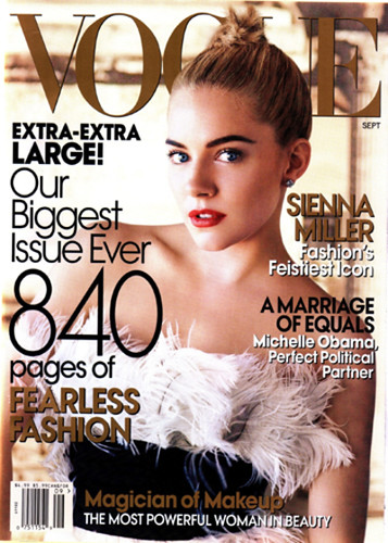
The September Issue is a documentary that gives viewers a look at the inner workings of Vogue as the editorial and design teams work to produce its 2007 September issue (the biggest print magazine publication ever printed, also known as "the Bible" within the industry).

Let me preface this response before I get going on my high horse. I generally care very little about Vogue and its place in the fashion industry, nor am I a fashion aficionado. I can't wrap my head around the concept of spending thousands of dollars on trends that will be out of style in a few months. I buy clothes that I like and know I can wear for years (and I try not to spend very much on them, either). I thoroughly enjoyed The Devil Wears Prada simply because I find the lifestyle to be absolutely ridiculous. So at the very least, I was curious to observe "real life" interactions at such a publication. Thus, this response will likely be biased due to my preconceived notions regarding the industry and Vogue itself.

First of all, I found the creative director's primary role (at least her role as represented by this documentary) to be disturbingly disappointing. Grace Coddington apparently holds a position through which she organizes fabulous photographic storyboards that are ultimately passed over for more intriguing coverage of celebrities (shocking). She flexes her creative muscles only for a large part of her work to be left behind on the cutting room floor. And it's not because the work isn't great; it's a direct result of the magazine's priorities (which stem from the fact that they need to be able to sell magazines, of course.)

For example, Grace's concept for the roaring 20s feature, Paris, je t'aime, was absolutely exquisite. She selected the perfect outfits and then executed the shoot in a completely believable way. Furthermore, the formal artistic compositions that reside within each individual frame captivates me. I can absolutely appreciate the magnificence of the clothing within this feature (although I'm not persuaded to buy any of the pieces, ha.)

Ultimately the documentary depicts a one-way relationship between Grace and Anna. Anna tells Grace to work on a feature, Grace produces something great, Anna changes her mind, much of Grace's work was for naught. Granted, she is the creative of one of the world's most renowned fashion magazines. But it does beg this question: how much can one compromise ones self-respect as a designer for the "overall good'" of a fashion magazine? Apparently Grace decided a long time ago she could compromise a lot.

This documentary taught me a few things about the role of a creative director in a big time publication (like Vogue). If this is how creative specialists are typically treated at big time publications, I might be re-evaluating my next plan of action as I prepare to enter the professional realm as a full fledged adult for the first time.  Oh well, I wasn't really planning to get too far outside of the Midwest, anyway. At least now I won't have to worry about missing out on anything.

In any case, I won't be sending my resume in to Vogue any time soon. I'm far too realistic, sarcastic and narcissistic to put up with such "stuff".

***If you share similar skeptical feelings about the topic, you should definitely check out this blog about Vogue's September issue. It's absolutely fabulous.***

Tuesday, February 22, 2011

You can't miss: Make as many mistakes as possible (except when it comes to web design)

mistakesIn a previous blog post, the Ministry of Type shared a project called Advice To Sink In Slowly, which is a project through which college graduates pass on advice to first-year students when they first move in. According to the Ministry of Type:
"Graduates design posters to illustrate their piece of advice, and each new student is given one at random — the idea being that each graduate now knows something they wish they’d known when they started, and that this is how to pass on that advice in a creative and welcoming way." 
The posters come from a wide variety of designers who have very unique styles. They're definitely something to check out. This one is a screenshot of one of my favorites.

Although you might learn a lot from your mistakes, you probably hope to avoid making them when it comes to web design. UseIt.com features an article that outlines the top 10 web design mistakes that make a site harder to navigate. The list is something to consider for anybody looking to design a website for the first time. (Interestingly enough, UseIt.com is actually very poorly designed itself.)

Since we're all going to have to create a website for our portfolios, this is definitely something that those new to the web design world should take a look at.

Here's a short synopsis of the list:
  1. Bad search keywords
  2. Unnecessary use of PDFs (my blog's nameplate just shivered)
  3. Not changing the color of visited links
  4. Text that can't be skimmed for key points
  5. Fixed font sizes (that are tiny)
  6. Page titles with low search engine visibility
  7. Anything that looks like an advertisement (as designers, we can appreciate this)
  8. Violating design conventions (not sure I agree with this one)
  9. Links that open new browser windows
  10. Not answering users questions (appreciate your audience!)
Although I don't agree with all of the suggestions, the list does outline some key points to keep in mind as we begin making plans for our online portfolios.


Critique: nosh magazine prototype

NoshCoverFor our final project we're developing magazine prototypes for a major magazine publisher. My group is working on a publication called "nosh," which is a magazine for young adults who prefer to eat healthy snacks throughout day rather than three larger meals.

The following are some concepts I developed to help me keep on track as I created my prototype.
    branding
    • “savor the small things” 
    • allow the readers to consume the magazine as they would their food: in bits and pieces
    • the content should be easily accessible
    • articles should be quick reads that busy young
    • adults can consume and relish. short & sweet.
    • readers want to display nosh on their coffee table and pass it around to their friends
      design tone
      • light
      • fresh
      • clean
      • a modern adaptation of “retro chic”
      covers
      • will feature photos that use simple yet elegant compositions and vibrant colors
      • fonts and sell lines set the tone for the magazine
      • nothing bland or predictable 
      departments
      • trendy, fresh color palette
      • photos feature people reaping the benefits of advice found within the department
      • recipes correspond with each department
      • take advantage of space in a way that does not overwhelm the reader 
      features
      • dramatic use of art to entice the reader
      • fonts suited to the tone of the story
      • healthy food is both aesthetically pleasing and fun to eat, so it should be presented that way
      The following spreads feature the sample designs I created for my prototype.
        color palette and lifestyles feature splash page
        NoshColorAndSplash

        lifestyles sample spread
        NoshProfileFeature

        department spread
        NoshDepartment
          additional feature spread
          NoshFruitFeature

          Anyway, I can't wait to see which of our four designs gets chosen. (See Theresa's design here, Christina's design here and Tanya's design here.) The winner will act as art director for the project, and the whole team will work together to create a professional magazine prototype.

          Cheers!

          Wednesday, February 16, 2011

          Response: Mag+, designing for the iPad

          MIM SOFTWARE INC. APP
          In this week's VOX staff meeting we had the opportunity to take part in a Skype session during which we were able to learn about Mag+ directly from its creator. Mag+ is a relatively new program for designing iPad content that is compatible with InDesign CS4 and CS5. This means that today's designers now have ability to begin developing designs for iPad applications much more quickly and efficiently than has previously been possible.

          Photo courtesy PRNewsFoto/MIM Software Inc. via Associated Press

          This is not only great news for designers interested in working with multimedia, but all designers looking for a way to get their foot in the door of the design industry. Having an understanding of how to design on the iPad platform will undoubtedly prove beneficial for young professionals looking to boost their resumes with valuable skills and experience.

          I'm not sure how much further I intend to pursue design in the context of journalism. However, if I do decide to study the field more in the future, then I would defintely look into the Mag+ program.

          The only thing is, with the way technology is today, iPads could be obsolete in a few years, ha. Like Jan said, by then the journalism industry will have found the next big craze.

          You can't miss: the artistic process behind typography, painting and more

          This week, Ministry of Type considers the artistic process versus the end result. The commentary tracks a typographic artist as he creates typefaces, which begins with hand-drawn letters and ends with digitally rendered typefaces created using Illustrator's vector. The post inspired me to contemplate how understanding the artistic processes of different media can help us in our quest to create better art.

          art processAs designers we each have our own thought processes we work through with each new project we produce. We might have a great idea, but as the design progresses we might realize that we don't have the ability to execute it successfully and/or professionally. Conversely, we might have a vague idea of something we want to create and end up with something truly extraordinary.

          As modern artists working in a digital medium, I think that we often place more importance on the end result without appreciating the process that got us there. As graphic designers using state-of-the-art software, we can easily backtrack, fix or change our creations at any point while creating a work.

          Rodabaugh_still_lifeHave you ever painted a still life? I have. It took months, and I absolutely hated it. About a year ago I took a beginning painting class for my fine art minor. I gained an appreciation for the artistic process that I had never before considered. I also learned it's important to plan ahead and make decisions with precision and care when creating a work of art.
          my pitiful attempt at a still life>>>

          While painting a traditional still life, the painter progresses in layers. The first layer is a monochromatic yet completely detailed painting. Then the painter adds layers of glazes that have painted tints. Over and over. The average still life has about 10 layers of glaze, which is what gives (good) paintings their realistic depth and precise details.

          Typically, painters wanting to make changes have to wait for the paint to dry before correcting any mistakes. Photographers have to know how to expose their film in certain lighting, knowing they can only make limited corrections while developing the film in the darkroom. Sculptors, well, if they take away too much, good luck fixing that. 

          My painting professor, Nathan Sullivan, obviously understood the process. You can't miss his work; it's amazing

          In the end, I really didn't like how my still life turned out. I have no desire to ever display it anywhere (other than here, ha). However, the experience pointed out that our generation is impatient and wants instant gratification, even when it comes to creating art. I must admit that I am no different, which is something I need to keep in mind as I create my magazine designs.

          In the end, graphic designers have it easy. We should appreciate the ease of our medium and take the time to fully contemplate our artistic process.

          Critique: social smoking cover (or "the evolution of a design")

          Rodabaugh_GenerationY_Smoking_CoversAfter last week's critique, the VOX editors decided to go with my cover choice. I was told they appreciated my initiative to tone the photo on my own. The original photos had yet to be toned, and as a result they were almost too dark to work with as far as designing goes.
           my original concept>>>

          Here's what I turned in (and what they subsequently chose) to be worked on as the VOX cover for the social smoking feature.

          RodabaughSocialSmokingCoverRevision

          After being chosen, the editors had a number of suggestions for the design. They thought the blurbs took up too much space at the bottom and compromised some of the photo. They also wanted the headline repositioned. When printed, the hot pink blended in with the background too much, so I needed to re-evaluate my color usage.

          Here is how I revised the cover for print.

          Rodabaugh Social Smoking Cover Final

          Although the art directors all approved of my decision to use three colors, upper management did not. I was required to downgrade from using three colors to only two, which I found to be extremely problematic. I liked how the top to colors balanced each other out and worked in contrast against their respective backgrounds, so I really didn't want to get rid of either of them. However, replacing the orange with either the turquoise or the pink would have made the overall color use unbalanced. Changing the orange to white would have made the deck blend in with the headline too much.

          After a lot of deliberation, Aaron and I came up with a solution we found to be the least of all evils. Here is the final product that VOX printed.

          Social Smoking Printed

          I wasn't a fan of the new headline, so I searched for a new font that didn't look as awkward with these new words. I found one that was similar in nature but didn't have "G's" that seemed as weird. I'm also not a super huge fan of how we did the blurbs, but the issue with three colors versus two really limited the options. (This is also the officially toned version of the photo.) I think the use of only two colors makes the story look much more drab than it actually is.

          In the end, I definitely prefer the product of my last revision before the color issue came up. As far as designs go, that's the one I'll be keeping in my portfolio. Working on this cover definitely taught me a lot about the editorial process.

          (Did you notice that I wrote my own blurbs on my drafts? I got tired of reading "Billy Joel coming to town" and the like.)

          Wednesday, February 9, 2011

          You can't miss: Alphabet Guy and tiny letters

          alphabetville

          In this week's edition of "you can't miss," I'm taking a closer look at the very first design element I ever learned about: letters. To get started, check out Alphabet Guy's outstanding typographic designs. Alphabet Guy, otherwise known as Alan Ariail, has been working with typefaces and lettering for more than 25 years. He creates custom lettering for clients and has a great grasp for the type of work he does (pun intended).

          "Lettering has rhythm, flow—including spacial relationship with positive and negative balance. If a consumer cannot easily read the lettering on a printed package, then it fails. My goal while working with designers has always been to create beautiful, easy-to-read lettering with rhythm and balance no matter what the style is."

          Alphabet Guy's work is amazing, and it's all hand drawn, which is definitely something to appreciate. His creations are absolutely beautiful. Even if you aren't a huge fan of scripty fonts, you have to respect what he's been able to create. He also redesigns name brand logos like Raisin Bran and Country Time. Everybody should definitely take a few minutes to explore Alphabet Guy's website. Trust me, you won't regret it.

          textposter

          The blog I've been following, Ministry of Type, didn't have a new post added this week, so I looked through some of the older posts to find something worthwhile to share. To some, the photo above might look like an accounting spreadsheet; however, the content contained on those pages is far from mathematical.

          ***Geek alert for all you intellectual readers out there*** According to Ministry of Type,  All The World’s A Page is creating posters on which entire literary works such as Hamlet, The Illiad and Faust can be read. According to the producer, the typeset for The Illiad is 3.25pt Malaga. The poster is about 28 inches wide and 30 inches tall and costs about $32 (excluding shipping). That's a lot of tiny letters on one big poster. Happy reading!

          Tuesday, February 8, 2011

          Response: historical influences on modern design

          As I mentioned in last week's response post, William Owens's book Modern Magazine Design offers readers an evaluative synopsis of the evolution of graphic design as both an art and as a journalistic tool. The following are a few historical designs from the book that have impacted graphic design as we know it in today's realm of magazine design. Along with each design I've featured a contemporary layout that appears to have drawn inspiration from the original.

          Historical Inspiration: Vogue, September 1955.
          Owens explains that Vogue was the first magazine to popularize extreme, full page close-ups of women. The publication's punchy layouts were the first to draw in readers by using the "startling close-up stoppers." As a consumer of modern magazines, it's difficult to imagine this sort of layout being viewed as revolutionary, as it's obviously become the norm for many magazines geared toward women.

          SeventeenEyes
          VOGUE_CLOSEUP

          Contemporary Design: Seventeen, December 2010/January 2011
          Although it pains me to admit that I actually own a recently printed issue of the teeny-bop publication (last semester I studied the use of sex in magazine advertisements), I must admit that I was taken aback upon seeing this layout. I typically find designs in Seventeen to be loud, cluttered and, at times, just plain obnoxious. I feel like this spread is a refreshing anomaly for the publication. From the facial expression to the color palette to the information contained within the layout, this spread clearly refers to Vogue's original, revolutionary concept. I find both to be absolutely exquisite.

          Historical Inspiration: The Face, May 1985
          According to Owens, the art director of this design used an elaborate typographic treatment to create a more formal separation between the text and the the image. Owens also explores the use of reflection, as Morrissey's face appears to be "doubled by cropping along the axis of reflection."

          NewFlip
          mirror

          Contemporary Design: Spin, November 2010
          This design features Robyn, a Swedish pop star and "electro-queen" whose career as a young starlet first peaked at the same as Britney Spears. Side by side, these two layouts are comparable in a number of interesting ways. Similar to the Morrissey spread, this layout features a bold typographic treatment and also plays with the idea of reflection. Both spreads work to balance the page of text with the page featuring the photo by utilizing white space and interesting typography.

          Historical Inspiration: Links Richten, no. 9 1933
          According to Owens, this Dutch worker-writer magazine cover was created using minimal components. I find this design to be eerily beautiful. The head shot is disturbing, and the type treatment is cold. The use of red adds tension to the design. The design is masterfully crafted with just a few visual elements, but its connotation is intentional and easily observed.

          CroppyCloseupSPINcutout

          Contemporary Design: BRM, Issue No. 12
          This page features a band called The Local Natives. It's just one page of the spread, but I think it definitely gives off a similar aura as the Links Richten cover. The image image has been toned in a way that gives eery, old sepia color with harsh contrasts. The men have been cut out to look like they're actually coming out of the page. This design also uses red to highlight the quote.

          This are just a few examples of how much historical thought processes continue to influence modern design as we know it. As designers, the more we understand about the history of graphic design, the better equipped we will be to create interesting and thought provoking designs in the future. 

          >>>danielle<<<

          Sunday, February 6, 2011

          Critque: Social Smoking Covers

          lighterWell, all of the shenanigans leading up to this project sure did take a whole lot out of me. Of course there was Comosnowpocalypse, which prevented my pitiful Pontiac Sunfire from getting to campus so that I could work on anything tangible. An unexpected sledding injury resulted in a 6 1/2 hour visit to the local ER Wednesday afternoon/evening. As a result I spent the next three days in bed attempting to heal myself.

          In an ultimately feeble attempt to work on my design project from home, I downloaded the 30 day trial version of Adobe's creative suite. I was obviously not happy (nor prepared) to set aside 12 hours for its snail-paced download onto my system. Wow. I woke up this morning ready to install it when I learned that my janky old Mac system apparently doesn't support InDesign CS5...$%*#! Needless to say, I got my (injured) rear in gear and was on campus by 10 a.m. prepared to fully dominate both my design and photography projects. Serious productivity (and Red Bull) allowed me to achieve my goal.

          Now to the nitty gritty that is critique blogging. The story I'm working with offers a new perspective on an old habit: smoking. The journalist working on the story observes that young adults in Columbia are following a trend of smoking socially rather than habitually.

          In other words, smoking is a fun hobby done in social situations—not in daily life. As a college student, I don't think there's really any new, shocking information in the story, but it is noteworthy that this is a trend that's starting to gain some attention. In its entirety the story discusses smoking habits involving cigarettes, hookah, and a limited amount about marijuana (for obvious reasons).

          Because the story maintains a light tone, it needs a design that relays a similar feeling. Keeping my technical abilities and limitations in mind, I've created the following three concepts as potential covers for the story.

          Cover 1: the social (smoking) network

          Rodabaugh_social_network_smoking_cover

          This article is a blatant parody of a certain social networking site *GASP*. Creating replicas of the buttons took the most time. Finding the best photos for the profile shots was also challenging due to the limited availability of certain subject matter on free photo stock sites. If this design is chosen to proceed, then I will probably invest some of my own money in a better image to represent marijuana. (The best ones I found charged fees I wasn't willing to pay upfront.) Ideally I would like to use a vertical image in place of the pipe so the design is more consistent overall. This should also remove the awkward white space.

          Cover 2: Generation Y (are you smoking?)

          Rodabaugh_GenerationY_Smoking_Covers

          I came up with this head and deck myself (although the deck admittedly needs work). I think that one of the most interesting aspects of the story is the fact that young adults growing up in Generation Y tend to be social smokers rather than habitual smokers. The story tries to answer the question of why this is so.

          In this cover I tried to play off the trendy-indie hip qualities that seem to represent Generation Y. I think this cover is pretty successful, but to move forward with it we would either have to shoot our own photo or find a comparable one that's big enough to take its place because this one looks a bit pixelated when printed full-size. I also question whether the use of parentheses might confuse the reader.

          Cover 3: Light up the Night

          Rodabaugh_Light_Smoking_Covers

          I don't think the VOX editors will choose this design, but I always seem to be drawn to minimalistic designs myself. While searching for various images related to smoking, I came across this photo and fell in love with it for some reason. The color, repetition and balance are all great, and I love the subtle reflection beneath the lighters. The head and deck were provided, although I did question how well it pairs with the image since there aren't actually any flames in the image. In the end I think this would be a simple way to communicate the story's basic subject matter to the reader, but it doesn't really go much further than that.

          So what do you think? I'm a big fan of constructive criticism. I'd rather have my designs torn apart now so that I have a chance to really make something great for the final product.

          Dang. After staring at all these designs, it's time to go get my nicotine on. (kidding)

          >>>danielle<<<

          Thursday, February 3, 2011

          Response: the historical importance of "the grid"

          Game Grid This week's reading, "Illustrated magazine and the photographic revolution," outlines the historic evolution of graphic design as both an art medium and a journalistic tool.

          The article discusses a number of major developments and trends throughout the evolution of graphic design, but none so impactful or enduring as the grid. As designers, we have been taught to utilize grids for three key purposes:
          1. streamline and organize content
          2. assist readers in comprehension of the story 
          3. keep layouts consistent from issue to issue
            The grid from "Tron: Legacy"              
          Even the most complex, intricate designs almost always follow an underlying grid, whether or not the viewer recognizes it.

          Interestingly enough, the article reveals that the origin behind the initial use of the grid was inspired by a graphic storyboard. The illustration was used to "associate disparate elements in both space and time." This directive relationship used to keep story lines intact became universality recognized as the most significant organizational requirement expected of formatted magazines. I find this expectation to be very appropriate while considering the role grids play when it comes journalism: to organize a story and help readers understand it.

          The following excerpt from the article explains the grid's significance to both design and journalism.

          Mondrian_Comp10"The magazine is a continuum of cover, contents page, minor features, major features and miscellany, with a specific architectural integrity which, in this respect, differs from other forms of printed matter. This is why the grid takes on a double function in the magazine. The underlying geometric framework suggested by the work of the synthetic cubists and rather more directly by the compositional studies of Mondrian and can Doesburg, could be utilized as an anchor of constancy, or point of reference, with unrestrained asymmetric layouts."


          Piet Mondrian's  "Composition 10" (1939–1942) inspired the use of the grid in graphic design.

          In the end, what I've taken away from this reading as a whole is that graphic design as we know it didn't just begin thriving as technology progressed. To fully appreciate it as both an art medium and as a journalistic tool, we need to understand its historical significance as well as how it has evolved over time.

          Tuesday, February 1, 2011

          You can't miss: bold color palettes—then and now

          filmnoirpostersColor is one of the seven major elements of art, and it's not hard to understand why. Using color effectively can communicate specific messages and evoke certain feelings.

          This week, Ministry of Type featured some great film noir posters. The blog links to a countdown of the best posters that have been created to advertise the niche films.

          The composition and design techniques are are both intriguing and inspiring to me. I especially appreciate the bold use of color and the harsh contrasts employed. Most of the posters feature simplistic color schemes created by combining simple primary and secondary colors. The designers obviously took great care in considering how different colors play off one another to evoke certain feelings.

          Chihuly

          This is a painting created by my favorite present-day artist, Dale Chihuly. He's most known for his work with glass. He creates these great blown-glass sculptures. Some are minimalistic and abstract while others take on natural forms.

          I've seen a two of his exhibits, one in Kansas City when I was in middle school and one at the Missouri Botanical Garden in St. Louis. While his glass sculptures are exquisite, I absolutely fell in love with his paintings. He has this technique where he splashes boldly colored paints onto huge canvases one after another. The finished result is a panoramic, abstract work of art with vivid colors. When you see them in person, they just engulf you.

          The above image is one of my favorites. It features more contemporary, yet still bold, color palette. And as a typical hipster female college student, of course I have a passion for neon colors.

          Whether admiring old movie posters or modern paintings, I can always appreciate the effective use of vivid color palettes. I think this appreciation can be observed in a lot of my work as a designer. 

          Cheers.

          Critique: spring preview design for VOX

          RainbowSlinky
          Hello fellow design enthusiasts. I hope all the locals reading this are thoroughly reveling in Comosnowpocalypse.

          Our last assignment was to create a design that showcased VOX's annual spring preview issue. I really enjoyed working on this project because we had a lot more creative freedom than we had for the first assignment (a photo essay). With this project I didn't have to worry about overdesigning or detracting attention from great photos as much.

          For those of you who might not know VOX's spring preview showcases upcoming events that will be hitting the Columbia area in the near future. Basically reporters gathered a ton of information that was given to designers to organize into monthly spreads. Needless to say, I knew it would be a challenge to find a way to organize all of this information in a way that attracts readers. 

          Before beginning work on the project, we were told not to put too much emphasis on conventional spring symbols like flowers, rain, umbrellas and the like. Editors suggested themes centered around the solar system or mechanics. Keeping these general rules in mind, I pretty much ran with this assignment.

          After considering the issue's theme and effective tactics for enticing readers, I came up with the idea of working with a slinky. (Slinkies are essentially "springs.") I started looking for images I could use in my design. Because I wanted to go with a retro look,  I considered ways that I could manipulate certain images for a bold look.

          I wanted to create a concept based on the type of art and design that I personally appreciate, something that would intrigue me if I found it in a publication. While it might seem arrogant to assume that VOX's audience would have similar reaction, I believe this type of design would appeal to a large part of VOX's readership: both the trendy "hipsters" as well as older readers who would have actually played with the original childhood icon.

          Cover

          RodabaughSpringPreviewCover

          I chose a color palette that was pretty much contained within the VOX color palete, which wasn't something I intentionally planned to do. I created the red color swatch, which I named "cool red," to complement the other colors. The font is "Knuckle Down," which I chose to download because it emulates the shape of the slinky. After re-evaluating my cover, I think that black slinky might be too dark on the teal (pool water) background if it were printed on newsprint paper. Overall, though, I am pleased with the final product.


          Splash

          RodabaughSpringPreviewSplash

          I wanted to tie the cover theme into the splash page. I chose a more dimensional slinky image to work with. I wanted to use the "cool red" color because I loved it so much. I changed up the font; the main one I used here is Greasy Spoon because I think it provides a different kind of retro feel.

          Feature

          RodabaughSpringPreviewFeature

          For the feature I wanted to carry on the retro theme and the same color palate without overdoing the whole slinky concept. To give the spread a subtle spring undertone, I initially wanted to use some partridge icons to accentuate the feature. After searching for some images, I decided that I wanted to do something a little bit different. A vintage shower curtain actually inspired these little bird fellows. Their eyes lead the reader around the spread. I used some placeholder photos because we didn't have actual stock photos at our disposal yet. I also created subheadings to split up the vast amount of information.

          Overall, I'm pleased with how my design turned out, but I can see where it might have been a little too obscure or minimalistic at times (especially the splash page). I'll be proud to showcase this design in my portfolio, as it's definitely one that expresses my personality as both a person and a designer.

          >>>danielle<<<