
Our last assignment was to create a design that showcased VOX's annual spring preview issue. I really enjoyed working on this project because we had a lot more creative freedom than we had for the first assignment (a photo essay). With this project I didn't have to worry about overdesigning or detracting attention from great photos as much.
For those of you who might not know VOX's spring preview showcases upcoming events that will be hitting the Columbia area in the near future. Basically reporters gathered a ton of information that was given to designers to organize into monthly spreads. Needless to say, I knew it would be a challenge to find a way to organize all of this information in a way that attracts readers.
Before beginning work on the project, we were told not to put too much emphasis on conventional spring symbols like flowers, rain, umbrellas and the like. Editors suggested themes centered around the solar system or mechanics. Keeping these general rules in mind, I pretty much ran with this assignment.
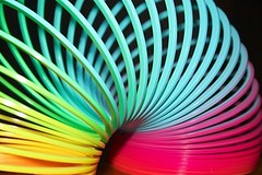
After considering the issue's theme and effective tactics for enticing readers, I came up with the idea of working with a slinky. (Slinkies are essentially "springs.") I started looking for images I could use in my design. Because I wanted to go with a retro look, I considered ways that I could manipulate certain images for a bold look.
I wanted to create a concept based on the type of art and design that I personally appreciate, something that would intrigue me if I found it in a publication. While it might seem arrogant to assume that VOX's audience would have similar reaction, I believe this type of design would appeal to a large part of VOX's readership: both the trendy "hipsters" as well as older readers who would have actually played with the original childhood icon.
Cover
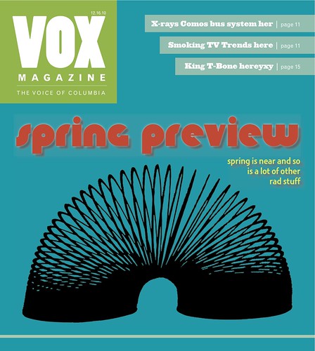
I chose a color palette that was pretty much contained within the VOX color palete, which wasn't something I intentionally planned to do. I created the red color swatch, which I named "cool red," to complement the other colors. The font is "Knuckle Down," which I chose to download because it emulates the shape of the slinky. After re-evaluating my cover, I think that black slinky might be too dark on the teal (pool water) background if it were printed on newsprint paper. Overall, though, I am pleased with the final product.
Splash
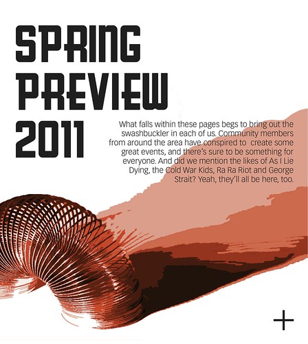
I wanted to tie the cover theme into the splash page. I chose a more dimensional slinky image to work with. I wanted to use the "cool red" color because I loved it so much. I changed up the font; the main one I used here is Greasy Spoon because I think it provides a different kind of retro feel.
Feature
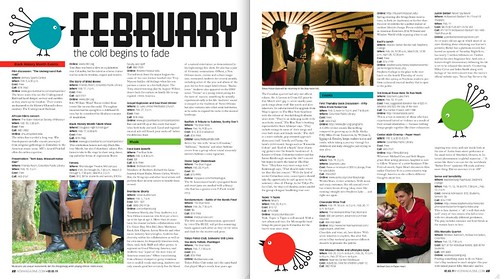
For the feature I wanted to carry on the retro theme and the same color palate without overdoing the whole slinky concept. To give the spread a subtle spring undertone, I initially wanted to use some partridge icons to accentuate the feature. After searching for some images, I decided that I wanted to do something a little bit different. A vintage shower curtain actually inspired these little bird fellows. Their eyes lead the reader around the spread. I used some placeholder photos because we didn't have actual stock photos at our disposal yet. I also created subheadings to split up the vast amount of information.
Overall, I'm pleased with how my design turned out, but I can see where it might have been a little too obscure or minimalistic at times (especially the splash page). I'll be proud to showcase this design in my portfolio, as it's definitely one that expresses my personality as both a person and a designer.
>>>danielle<<<
I thought this was a really fun idea for the spring preview assignment. I like the use of a "spring" and how it not only plays with the title but has a retro feel. The layouts for the cover, splash page and spread are all well-balanced designs and have fun elements that guide you around the page.
ReplyDeleteMy critique would be that although there are elements of your concept on each of the pages, it doesn't feel visually tied together as much as it could be. I feel like if the illustrations with the slinky/(very CUTE!) birds were all done in the same style, it wouldn't feel as disconnected. That said, the colors and bold use of fonts do help keep it united. Overall, nice work!
I agree with you. I think I got tired of the slinky thing, but I wanted to try and keep the retro thing going. I hoped that keeping the same color palette and retro feel would be enough, but when you look at all three together there is obviously a disconnect. I think part of the reason I wasn't too concerned about the inconsistency was because I knew the editors were going to choose separate designers for the cover and the feature (and as it ended up, the splash page as well). I definitely wasn't as much of a stickler about the consistency throughout this design as I have been about others. Thanks for the feedback!
ReplyDeleteI like the retro theme that you went with. The birds that you created are very well done. I love the color palette throughout the entire design. Nice work!
ReplyDeleteI really like the splash page, it almost looks like a poster which goes well with a them like spring preview. I agree there's a disconnect between the cover, splash page and spread but your response to this makes sense.
ReplyDeleteOrganizing all of the events on a grid helps legibility, especially with features like Spring Preview when there is just an endless amount of information. Separating the categories by color is a great way to make them stand out.
You have a nice color palette going in your design. It feels fresh without looking stereotypically "springy." I agree with the above comments about the disconnect between the cover/splash page and inside spread. I think I like the inside spread the best — the birds, although a little "springy," feel unexpected and cool. If you were ever to revise, I almost think I'd like to see a cover or splash page with them as the main focus! Really fun, great job.
ReplyDelete