
 For our final project we're developing magazine prototypes for a major magazine publisher. My group is working on a publication called "nosh," which is a magazine for young adults who prefer to eat healthy snacks throughout day rather than three larger meals.
The following are some concepts I developed to help me keep on track as I created my prototype.
branding
- “savor the small things”
- allow the readers to consume the magazine as they would their food: in bits and pieces
- the content should be easily accessible
- articles should be quick reads that busy young
- adults can consume and relish. short & sweet.
- readers want to display nosh on their coffee table and pass it around to their friends
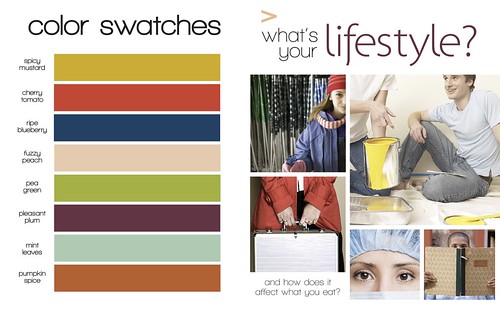
design tone
- light
- fresh
- clean
- a modern adaptation of “retro chic”
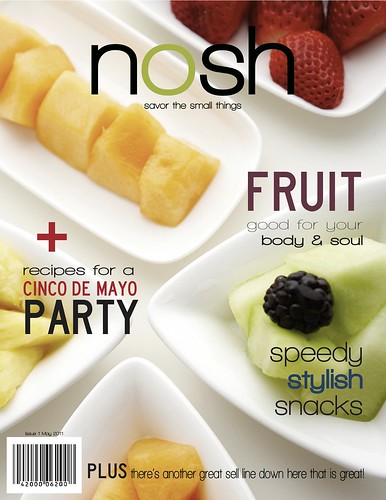
covers
- will feature photos that use simple yet elegant compositions and vibrant colors
- fonts and sell lines set the tone for the magazine
- nothing bland or predictable
departments
- trendy, fresh color palette
- photos feature people reaping the benefits of advice found within the department
- recipes correspond with each department
- take advantage of space in a way that does not overwhelm the reader
features
- dramatic use of art to entice the reader
- fonts suited to the tone of the story
- healthy food is both aesthetically pleasing and fun to eat, so it should be presented that way
color palette and lifestyles feature splash page
lifestyles sample spread
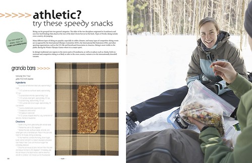
department spread
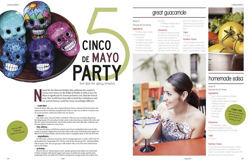
additional feature spread
Anyway, I can't wait to see which of our four designs gets chosen. (See Theresa's design here, Christina's design here and Tanya's design here.) The winner will act as art director for the project, and the whole team will work together to create a professional magazine prototype.
Cheers!
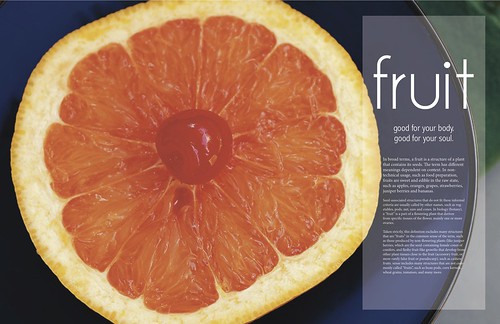
I adore the image on your opening spread for the fruit feature. It's really quite artistic, but also feels youthful and approachable.
ReplyDeleteI also think its a nice tie to the image you chose for the cover. Great work!
Your second draft is great. I love the logo and sell lines; they go really well with the tone. The lifestyles feature splash page is neat. I like the photo choices and the layout. I really like your title treatment on the department spread.The green circles are a nice element too. The other feature is gorgeous. I love the photo and the transparent box you use behind the text.
ReplyDeleteEverything is well organized and appealing. You did a great job portraying the light, fresh and clean design tone you're going for. Nice job!