 Color is one of the seven major elements of art, and it's not hard to understand why. Using color effectively can communicate specific messages and evoke certain feelings.
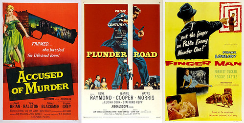
 This week, Ministry of Type featured some great film noir posters. The blog links to a countdown of the best posters that have been created to advertise the niche films.
The composition and design techniques are are both intriguing and inspiring to me. I especially appreciate the bold use of color and the harsh contrasts employed. Most of the posters feature simplistic color schemes created by combining simple primary and secondary colors. The designers obviously took great care in considering how different colors play off one another to evoke certain feelings.

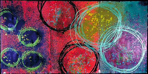
This is a painting created by my favorite present-day artist, Dale Chihuly. He's most known for his work with glass. He creates these great blown-glass sculptures. Some are minimalistic and abstract while others take on natural forms.
I've seen a two of his exhibits, one in Kansas City when I was in middle school and one at the Missouri Botanical Garden in St. Louis. While his glass sculptures are exquisite, I absolutely fell in love with his paintings. He has this technique where he splashes boldly colored paints onto huge canvases one after another. The finished result is a panoramic, abstract work of art with vivid colors. When you see them in person, they just engulf you.
The above image is one of my favorites. It features more contemporary, yet still bold, color palette. And as a typical hipster female college student, of course I have a passion for neon colors.
Whether admiring old movie posters or modern paintings, I can always appreciate the effective use of vivid color palettes. I think this appreciation can be observed in a lot of my work as a designer.
Cheers.

You seem to have trapped me, Danielle. I'm not sure how strongly I can emphasize my love of movie posters. I have around 100 up in my small apartment alone, and my hunger for movie art is insatiable. In this case, you've chosen one of my favorite genres of movie poster: the film noir. Because the Classical film noir period coincided with the painterly style of Hollywood movie posters, many of them bare a very similar, stark aesthetic. Something I've noticed in staring at my posters is that they essentially exist in a red-yellow-blue palette that rarely allows for strong, non-primary colors. Although the posters you've chosen are not the masterpieces of their time, they're still brilliant.
ReplyDeleteAs a lover of the pop art era I have always had a special place in my heart for film noir posters. Sometimes the color schemes can be a little predictable, but I think that I often overlook this because we don't see visuals like these in our generation of film/art culture. Sounds like I should check out you personal collection to see some great examples. They're great for inspiration. Maybe that's why you ended up with both film and magazine design majors :)
ReplyDelete