
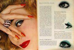
Historical Inspiration: Vogue, September 1955.
Owens explains that Vogue was the first magazine to popularize extreme, full page close-ups of women. The publication's punchy layouts were the first to draw in readers by using the "startling close-up stoppers." As a consumer of modern magazines, it's difficult to imagine this sort of layout being viewed as revolutionary, as it's obviously become the norm for many magazines geared toward women.
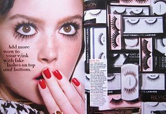
Contemporary Design: Seventeen, December 2010/January 2011
Although it pains me to admit that I actually own a recently printed issue of the teeny-bop publication (last semester I studied the use of sex in magazine advertisements), I must admit that I was taken aback upon seeing this layout. I typically find designs in Seventeen to be loud, cluttered and, at times, just plain obnoxious. I feel like this spread is a refreshing anomaly for the publication. From the facial expression to the color palette to the information contained within the layout, this spread clearly refers to Vogue's original, revolutionary concept. I find both to be absolutely exquisite.
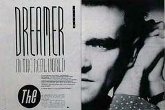
Historical Inspiration: The Face, May 1985
According to Owens, the art director of this design used an elaborate typographic treatment to create a more formal separation between the text and the the image. Owens also explores the use of reflection, as Morrissey's face appears to be "doubled by cropping along the axis of reflection."
Contemporary Design: Spin, November 2010
This design features Robyn, a Swedish pop star and "electro-queen" whose career as a young starlet first peaked at the same as Britney Spears. Side by side, these two layouts are comparable in a number of interesting ways. Similar to the Morrissey spread, this layout features a bold typographic treatment and also plays with the idea of reflection. Both spreads work to balance the page of text with the page featuring the photo by utilizing white space and interesting typography.
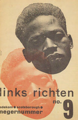
Historical Inspiration: Links Richten, no. 9 1933
According to Owens, this Dutch worker-writer magazine cover was created using minimal components. I find this design to be eerily beautiful. The head shot is disturbing, and the type treatment is cold. The use of red adds tension to the design. The design is masterfully crafted with just a few visual elements, but its connotation is intentional and easily observed.
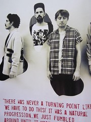
Contemporary Design: BRM, Issue No. 12
This page features a band called The Local Natives. It's just one page of the spread, but I think it definitely gives off a similar aura as the Links Richten cover. The image image has been toned in a way that gives eery, old sepia color with harsh contrasts. The men have been cut out to look like they're actually coming out of the page. This design also uses red to highlight the quote.
This are just a few examples of how much historical thought processes continue to influence modern design as we know it. As designers, the more we understand about the history of graphic design, the better equipped we will be to create interesting and thought provoking designs in the future.
>>>danielle<<<
I like the way you organized this post with the historical designs. Good thinking. That Vogue/Seventeen comparison is crazy side by side. I wouldn't doubt that the designer of the Seventeen spread had seen the Vogue spread. I think it's a good example of influence without walking the line of plagiarism.
ReplyDeleteAll of your examples are great! The Seventeen one for me almost borders plagarism, but I guess some could argue it homage. I'm all for taking inspiration from the past, but the Seventeen spread almost makes me uncomfortable because I don't the original was mentioned. Some people like to ride that fence, but I for one wouldn't want people to copy my work, so I'd rather make my designs as original as possible.
ReplyDelete