Wednesday, January 26, 2011

Response: thoughts on our prototype project

move After reading through the syllabus for my capstone course, I was mildly horrified to say the least. Just a few of the assignments include weekly blog posts, countless designs for VOX, research projects and a "commissioned" print magazine prototype for a major magazine publisher. Not to mention the online portfolios we need to compose to showcase our work.

Wow.

Nothing turns fear and intimidation into anticipation and excitement like hearing success stories from recent Missouri J-school grads who sat on my side of the table just a few years ago. And now they actually have real jobs that pay them to do something they love.

They urged us to leave our preconceived notions about the corporation at the door—this project is all about attracting a younger, more vibrant artist. You know, people like us.

I think the most insightful aspect of the discussion was when we viewed the recent redesign of Better Homes and Gardens. The publication has gone in a completely new direction in the past year. Part of our job as the designers for these projects is to give Meredith some fresh new ideas they can implement into their various publications.

Finally, seeing firsthand examples from previous designers who took this class really sold me on the project. I saw how designers took mundane topics like BBQ or arthritis and created youthful, trendy publications.

These projects are going to be our brainchildren, and I hope mine turns out to be a genius.

>>>danielle<<<

Tuesday, January 25, 2011

Don't miss this: Pacman and poor grammar

And now for a little excerpt I'd like to call "Designs from across the web." You know, because the internet is wonderful; it connects us to resources and designers all across the world. We should open our minds to the ideas of others so that we can execute designs that offer content driven projects with unique nuances. In order to entice our readers with attractive designs, we must first expose ourselves to new ideas.

Pacman
PacMan
I'm a big fan of unique tattoos, even if I wouldn't choose to showcase most of them on my own personal canvas. Apparently these are some of the weirdest tattoos out there. As far as designs go, I think it's definitely important to appreciate the fact that some artists can render these images on human flesh. My personal favorite is the PacMan.

Although some of these designs are definitely lacking in technical execution, many of them still offer unique concepts. Furthermore, I seriously doubt that I could have produced such a successful creation on the knuckles of a PacMan fanatic.

Poor grammar

This semester I'm following a blog known as "The Ministry of Type," which, as you can guess, features articles about typography.

The blog's most recent post, "Dot Dot Dot, An Animated Review" links to a really great animation constructed via typography. The video features a (very) poorly written video game review. The animation's total presentation and voice over are over-dramatic in a totally awesome way: if you have a few minutes and need a good laugh you should definitely check it out. Here's a sneak preview of the dialogue:

"pepole think this review is worthles.
go ahead! say it! i dont care! im just trying to make a point here!
blam this piece of crap!!!!"

End scene.

Thanks for appreciating my nerdgasm.

>>>danielle<<<

Critique One Pt. 2: slipping into the life of a designer

Week One: Part 2

Good news for all of my loyal followers: your preliminary interest in my potential ability to become a designer was not in vain—or so it seems.

Out of the 18 designs created for VOX's baby beauty pageant story, mine was chosen to be used as the feature. I was pleasantly surprised to say the least.  The final version of the design will be published in the Jan. 27 issue. Also, kudos to Tanya Oritz whose cover was chosen to be published.

Here's the (potential) final result of the two additional nights that I spent in VOX reworking my concept for the story, which of course took into account the editors' and art directors' suggestions.

Revised Opening Spread 
Revisions included a new title with a new "punchier" typeface. I moved the crown above the headline, which was my initial plan that I had abandoned at one point for some reason. The photo is now bled as well—something that my preliminary design also featured, but I changed this before submitting it the first time. 


finalVOXTiaraOpener

Revised Secondary Spread
Showcasing fewer photos means that we can run the select ones at a larger size. The use of fewer decorative features should achieve a more impactful photo essay. 

FinalVOXTiaraCenter

Closing Spread
We decided to end with this photo of Ellie because it's so simple and beautiful.

FinalVOXTiaraEnd

My proudest accomplishment is that we were (tentatively) able to keep the tiaras that I painted in watercolor and then rendered in Photoshop. HOLLA!

In the works: Spring Preview designs for VOX, which I will be spending all of Wednesday working on. Then it's on to designing VOX's art department over the weekend followed by three cover concepts due Thursday for the Feb. 17 issue. Can't wait to live in the design lab all semester!

>>>danielle<<<

Sunday, January 23, 2011

Critique one: baby beauty photo essay

The beginning of the end (or of the beginning?)
iStock_000000334922SmallI just spent the first weekend of my last undergraduate semester doing nothing but designing. I remember complaining about my lack of exposure to any design courses my freshman year. Ahhh, life has come full circle. I attended a Photoshop class over the weekend to ensure I maintain my full-time student status. It was a major timesuck and a distraction from my assignment, but I need to avoid paying off those pesky student loans for as long as possible.

Anyway, when I wasn't "relearning" Photoshop's various lasso tools this weekend I was working on the first project for my Advanced Magazine Design capstone course. The assignment: create a cover design and five page spread to showcase a photo essay for a localized "Toddlers and Tiaras" story.

I was enthralled when I learned of the assignment, as I am a HUGE fan of TLC's "Toddlers and Tiaras." It's one of the few shows I watch religiously because, well, I can't even explain it. It's really just something you have to experience for yourself. (It airs Wednesdays at 10 PM/9PM central in case you were wondering.)

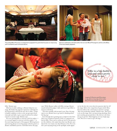
To my (slight) disappointment, the story we were given was not one of overzealous, ostentatious parents who have put themselves far into debt to ensure their little darling will be the next Miss America. The story featured a father who had given up his career as a NASCAR driver and now supports his daughter's pageant career (young though it may be). He has to help her walk across the stage not because she's too young to do so herself, but because her physical development is far behind that of her twin brother.

Long story short, the article wasn't about the utter ridulosity of the toddler pageant circuit. Rather, it told the story of a devoted father who shares a special bond with his daughter.
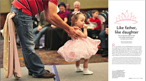
Cover
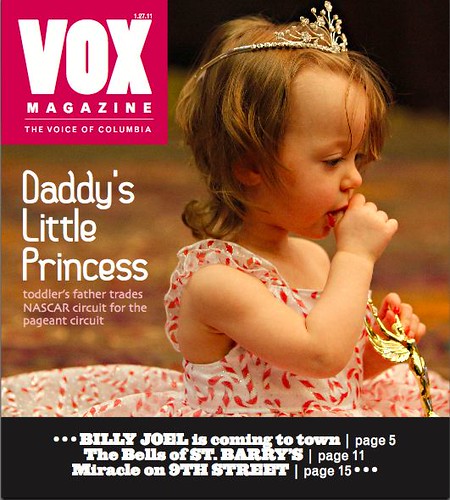
Using this photo for the cover was an obvious choice for me. I chose to use hot pink for the VOX masthead to give it some pop. I came up with the headline and the sub display on my own; I thought it captured the content and tone of the story perfectly. I chose fonts that expressed the same feelings and were also easy to read. 
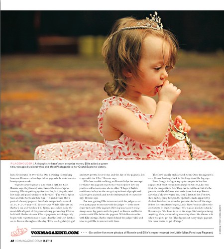
ToddlerTiara1

Opening Spread
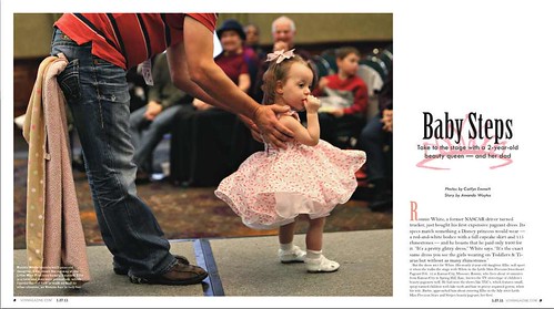
This photo shows how supportive Ronnie is of his daughter Ellie.  Since the assignment was to create a photo essay, I wanted the major elements of the spreads to be the photos. To complement the photos I hand-painted some pink tiaras with watercolor, scanned them into the computer and edited them in Photoshop.  I chose to use hand-painted tiaras rather than using Clip Art or actual photos because I wanted the spreads to have a youthful feel, as if a young girl could have painted on them.
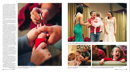
ToddlerTiara2

Second Spread
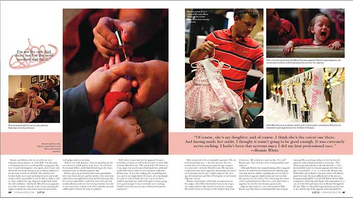
I absolutely LOVE the photo of Ellie's parents painting her nails. As soon as I saw it I knew I wanted to run it as large as possible. Kudos to Caitlyn Emmit for taking such an exquisite photo. 

ToddlerTiara3

Closing Page
This last page just shows the results of a day at the pageant. Overall I ordered the photos chronologically to show how a typical pageant works for the family.

ToddlerTiara4

This assignment challenged me in a number of ways. First of all, I had to make sure my perspective of the story as a designer matched the story's tone and content. I also struggled to find a happy balance while designing, as I neither wanted to over or under design the story. 

In the end, I believe my execution was successful. My only concern is that it may not wholly mesh with the designs typically featured in VOX. However, I am happy that the overall design matches the story's content and tone and also offers the audience a logical presentation how exactly this father and daughter duo works.

I'm looking forward to sharing my design experiences from this semester with anybody curious enough to notice. And who knows, a potential career in design might just follow.

>>>danielle<<<