The following designs are the culmination of my work as a designer for our
Nosh magazine prototype.
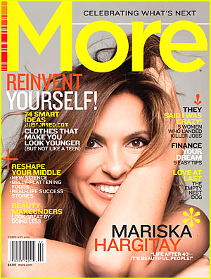
cover
The publishers wanted some extra covers for their prospectus, so I got a chance to design the autumn cover for
Nosh. The cover story is slated as "healthier halloween," and I didn't want to use cheesy autumn colors. I also created the sweet sell lines.
NoshMagazine.com
This page had a lot of information about the additional content readers can find both online and on iPads. I wanted to show people interacting since this page was all about interaction. Also, we had few opportunities to use photos with people since so many of our pages featured recipes and food histories, etc. I wanted to take advantage of my ability to run a great picture here as big as possible.
Seasonal snacking department page
The content on this page is about combining rhubarb with strawberries to make use of a pretty unique — or maybe just weird — vegetable. I found that phenomenal parfait photo, and Theresa suggested I bleed it to take full advantage of it. I think everything on this page just goes together.
Three ingredient snacks
This my least favorite of the pages I worked on. I never really liked how that vertical photo fit onto the page, but I just kind of went with it and kept working with it hoping it would evolve into something more interesting. Overall I think the page is too white for my liking, but there comes a time when you have to prioritize and move on with your life.
Feature: International snacks
Coming up with a concept for this took quite a bit of thinking, but I'm very pleased with how it turned out. I even came up with the title, which I think is pretty clever. You might notice the large amount of copy. Even though there was a lot of copy, I still decided to run the photos as big as possible because I thought they really lent to the story, even if that meant forfeiting my only real ability to use white space. I'm ok with my decision, though, because there's a great deal of white space on the splash page that opens the spread.
Packaged to homemade
The content on this page teaches readers how to take packaged snack foods and make them from scratch. I love that photo of puppy chow, and the color scheme turned out quite nicely.
You don't even want to know how much
noshing I did while working on these pages....


 After reading through the syllabus for my capstone course, I was mildly horrified to say the least. Just a few of the assignments include weekly blog posts, countless designs for VOX, research projects and a "commissioned" print magazine prototype for a major magazine publisher. Not to mention the online portfolios we need to compose to showcase our work.