Good news for all of my loyal followers: your preliminary interest in my potential ability to become a designer was not in vain—or so it seems.
Out of the 18 designs created for VOX's baby beauty pageant story, mine was chosen to be used as the feature. I was pleasantly surprised to say the least. The final version of the design will be published in the Jan. 27 issue. Also, kudos to Tanya Oritz whose cover was chosen to be published.
Here's the (potential) final result of the two additional nights that I spent in VOX reworking my concept for the story, which of course took into account the editors' and art directors' suggestions.
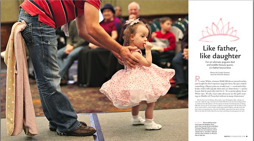
Revised Opening Spread
Revisions included a new title with a new "punchier" typeface. I moved the crown above the headline, which was my initial plan that I had abandoned at one point for some reason. The photo is now bled as well—something that my preliminary design also featured, but I changed this before submitting it the first time.

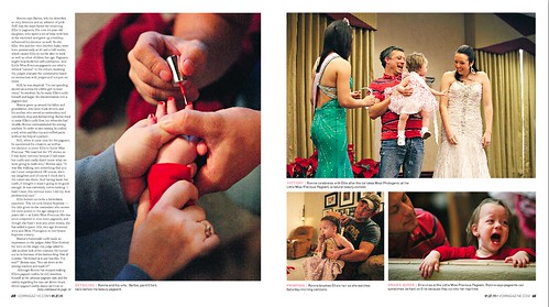
Revised Secondary Spread
Showcasing fewer photos means that we can run the select ones at a larger size. The use of fewer decorative features should achieve a more impactful photo essay.

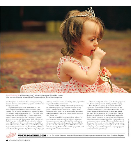
Closing Spread
We decided to end with this photo of Ellie because it's so simple and beautiful.

My proudest accomplishment is that we were (tentatively) able to keep the tiaras that I painted in watercolor and then rendered in Photoshop. HOLLA!
In the works: Spring Preview designs for VOX, which I will be spending all of Wednesday working on. Then it's on to designing VOX's art department over the weekend followed by three cover concepts due Thursday for the Feb. 17 issue. Can't wait to live in the design lab all semester!
>>>danielle<<<

Congrats on being chosen for the feature design! You did such a great job. Your spreads are beautifully done. The photos and text are placed in such a clean and sharp way. I love the tiara that you painted. You are very talented. I've always wanted to be a good artist, but it was never in my dna, ha.
ReplyDeleteI love the pacman tattoo. I played that for hours as a kid. I would have never thought to make a tattoo out of it, but it's neat to see. I look forward to reading your blog this semester. This is my first blog, so I'm trying to improve each week on it.
Good luck on your Spring Preview designs and covers, you'll do great!
I'm really glad you moved the tiara about the title on the opening spread. I think it made it a lot more readable. And I totally understand about taking photos out. I think it's something I should have tried doing myself after I finished a draft.
ReplyDelete