
Image courtesy Ministry of Type
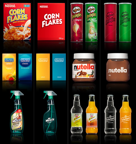
I'm not a fan of the simplified Corn Flakes box, as it doesn't really entice me to buy the cereal. I don't think the new Pringles cans are too great, either, but that might just be because the two examples shown are red and green, ha. I do find the Durex box and Nutella jar to be especially successful, though.
Michelle Pais showed me this really cool website last week, and I wanted to share it with you guys, too. Under Consideration.com maintains a few different, really interesting design blogs. One of them is Brand New, a blog that looks at company branding and logo redesigns. They're really cool and modern, and they might be helpful for everybody to look at as we develop logos for our 20/10 project.
Michelle Pais showed me this really cool website last week, and I wanted to share it with you guys, too. Under Consideration.com maintains a few different, really interesting design blogs. One of them is Brand New, a blog that looks at company branding and logo redesigns. They're really cool and modern, and they might be helpful for everybody to look at as we develop logos for our 20/10 project.
No comments:
Post a Comment