
Over the years I've found that I have a pretty good natural eye when it comes to combining colors, and I really respect it when others can do it successfully. With this in mind, I set out to browse the bound periodical section in Ellis (MU's main library) to find a magazine and decade to critique for our historical perspectives assignment. I wanted to find something that really did appeal to me visually, as well as something that would inspire me. I also wanted to look at a publication that offered an interesting perspective on the decade's cultural implications. After browsing for about an hour, I chose Ladies' Home Journal in the 1960s. Its use of color really captivated me, and I wanted to spend more time absorbing it.
The following are three of my favorite feature designs that I found in various issues of Ladies' Home Journal from the 1960s.
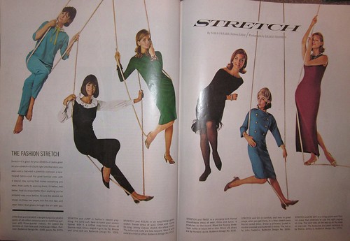
This feature was about some sort of new stretchy material for clothes. I think this concept seems pretty revolutionary for a magazine published in 1964, not to mention how successfully it was executed. But maybe I'm just underestimating the designers' abilities.
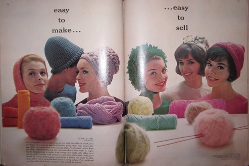
This feature was about knitting your own clothing, which you can also sell for extra cash. Not sure if that's a very realistic, profitable entrepreneurial goal, but who knows. Either way, the use of color here is just outstanding. I don't think I even need to justify that declaration.
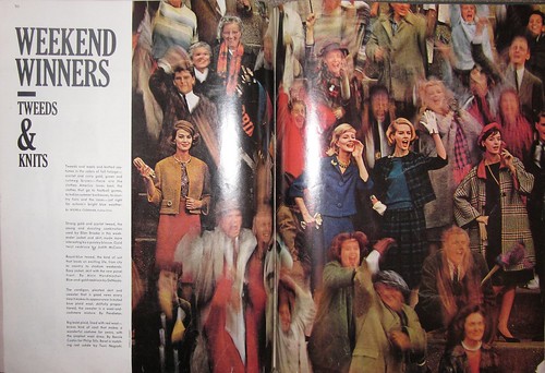
Out of the hundreds of spreads that I studied, this one stood out to me the most. The photo is absolutely spectacular. I've been studying photography for about a year now, and I can't figure out how exactly the photographer was able to create a blurred yet extremely focused photo while still maintaining such vibrant colors. And the type complements the photo perfectly. Everything about this design just feels right. Looking at it makes me feel happy.
And that's all I have to say about that :)
No comments:
Post a Comment