
02.03.11 arts department page
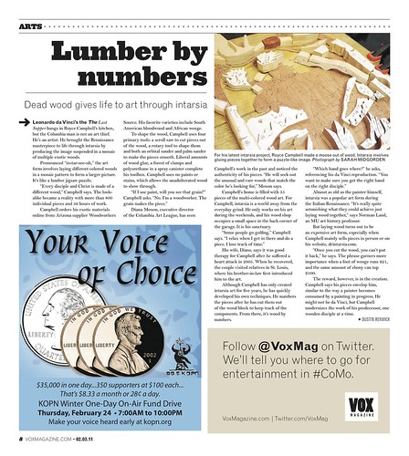
I played a lot of Tetris with this one. The "Lumber by Numbers" story was the only content slated for the page, and it wasn't very long. I tried making the photo larger to take up more space, but its placement combined with that of the ad would have required me to break up the text diagonally, which is a huge design no-no since it's not nice to make the reader jump around so much to read the story. Also, I didn't really think the photo was exciting enough to run very big, either.
After playing around with it for awhile (by breaking some of the VOX design rules), Aaron suggested I add a house ad at the bottom to help even out the spacing. This solution allowed everything to work a lot more fluidly, and I was able to follow all of the rules.
*Side note* I was in love with this headline; it's both clever and catchy.
02.27.11 arts department page
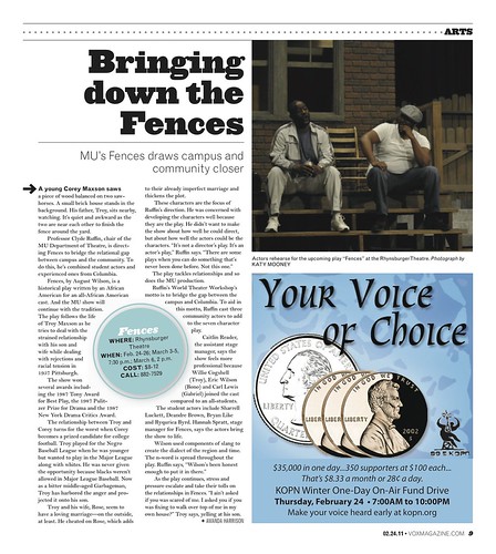
I faced a totally different Tetris challenge with this page. A sidebar story on a completely unrelated topic was also supposed to run on this page. I did spend some time trying to fit both stories on the page. Once I realized that both stories needed the pullout info bubbles I decided there was no way everything was going to fit, especially with the quarter page ad and the length of the "Fences" story. I think the final product here was pretty successful, even if it's not very "design-y." It does it's job.
I've been lucky enough to never have an ad placed on any of the pages I've designed (hopefully I'm not jinxing myself). For those of you that have, I think that you've all done a good job at making the design still make sense. It would be hard for me, especially because I'm so anal and really like to work off a modular grid, to fit text or photos in places where I don't feel they should have to be fit, but in both of your pages you've really made it work.
ReplyDelete